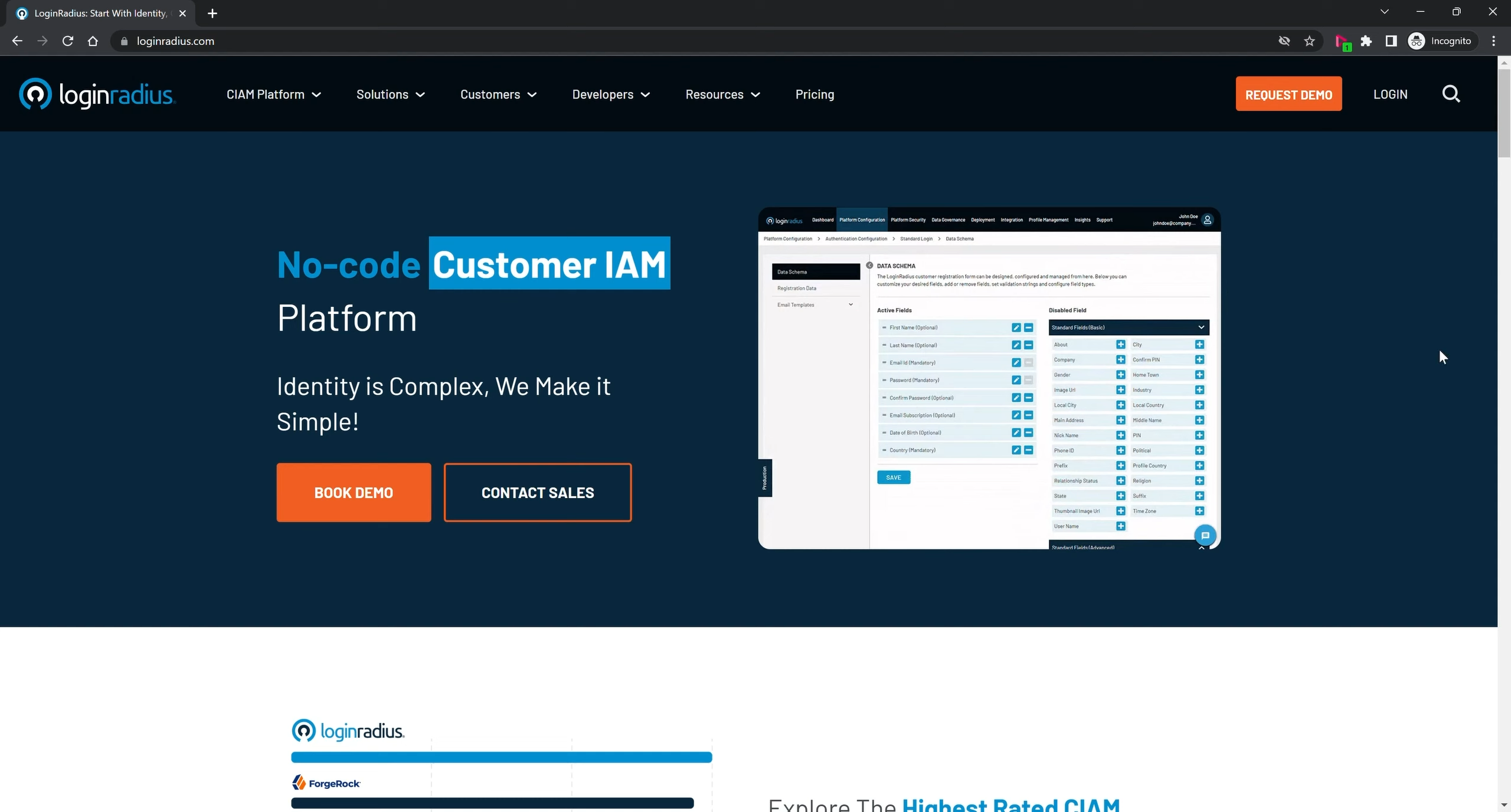
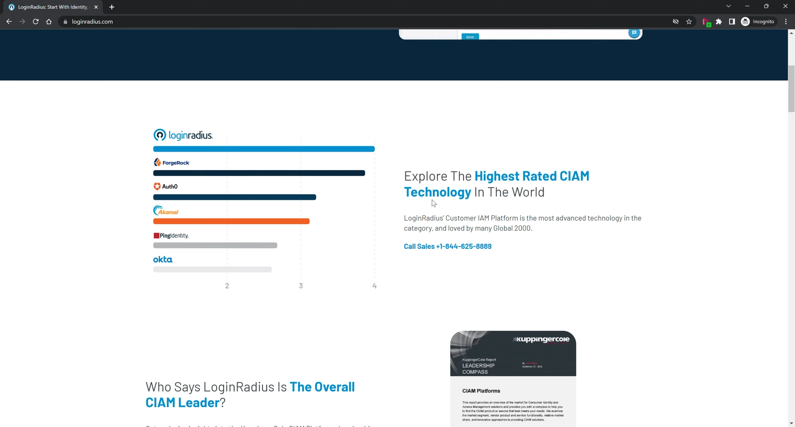
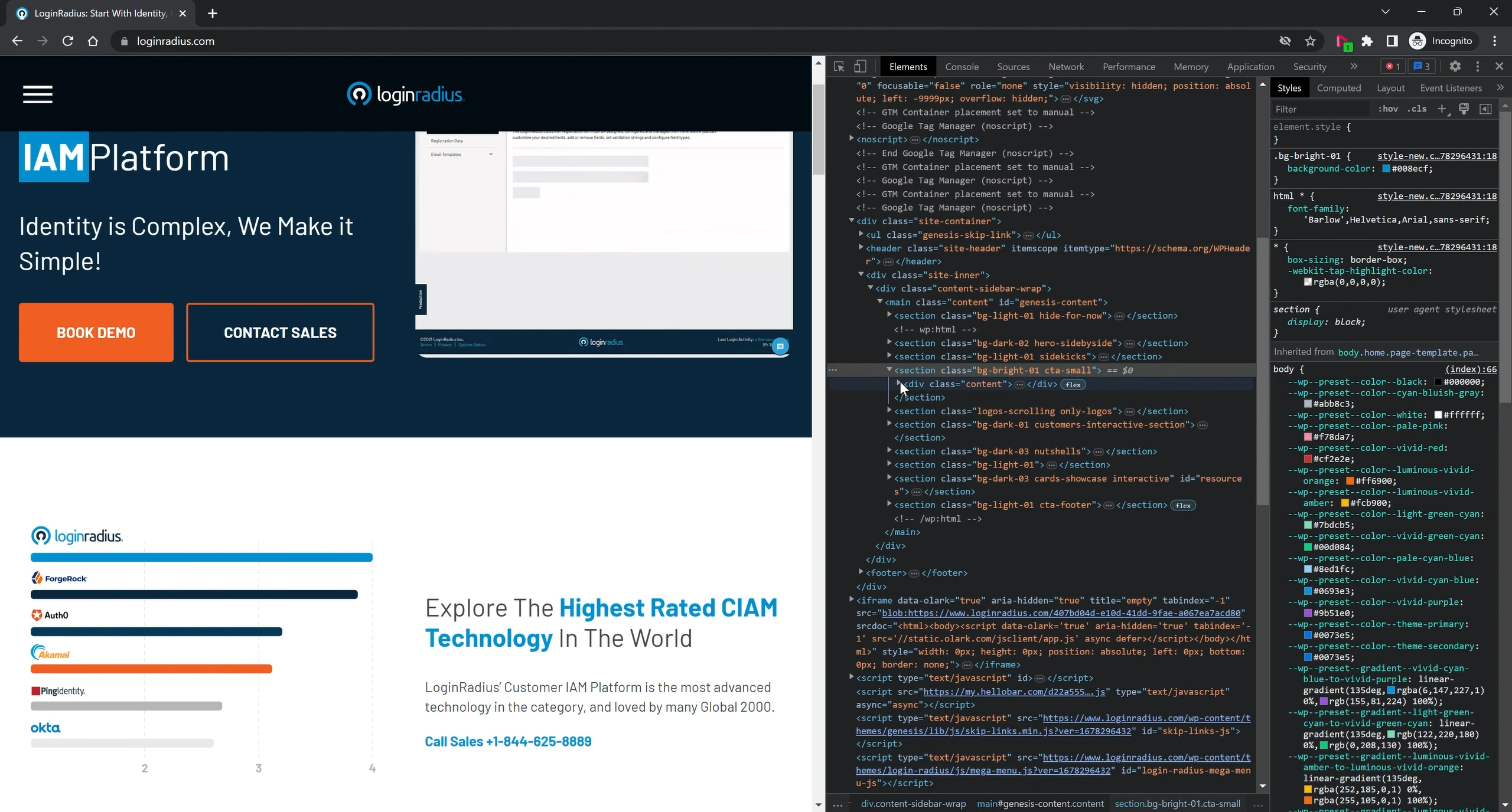
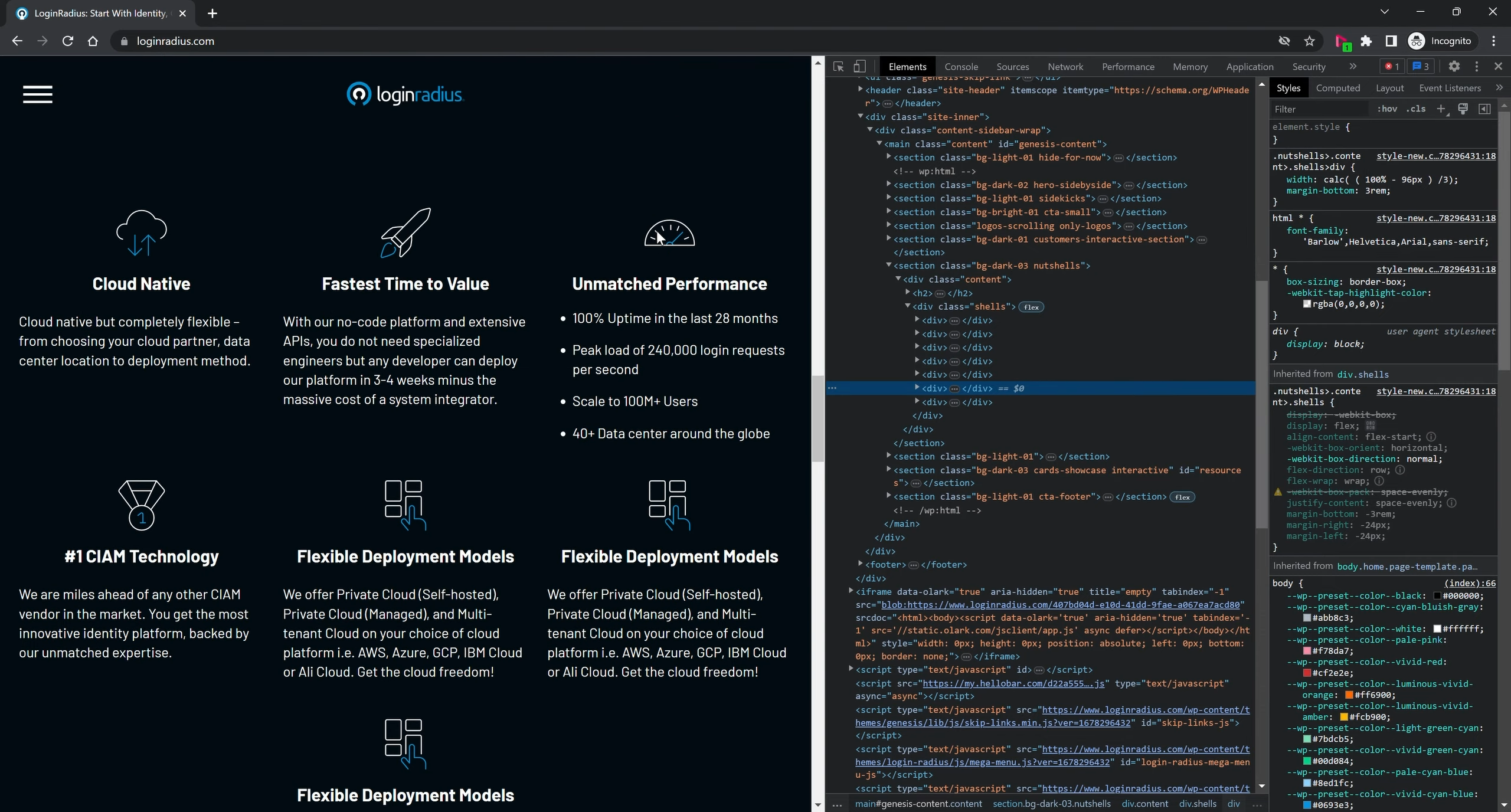
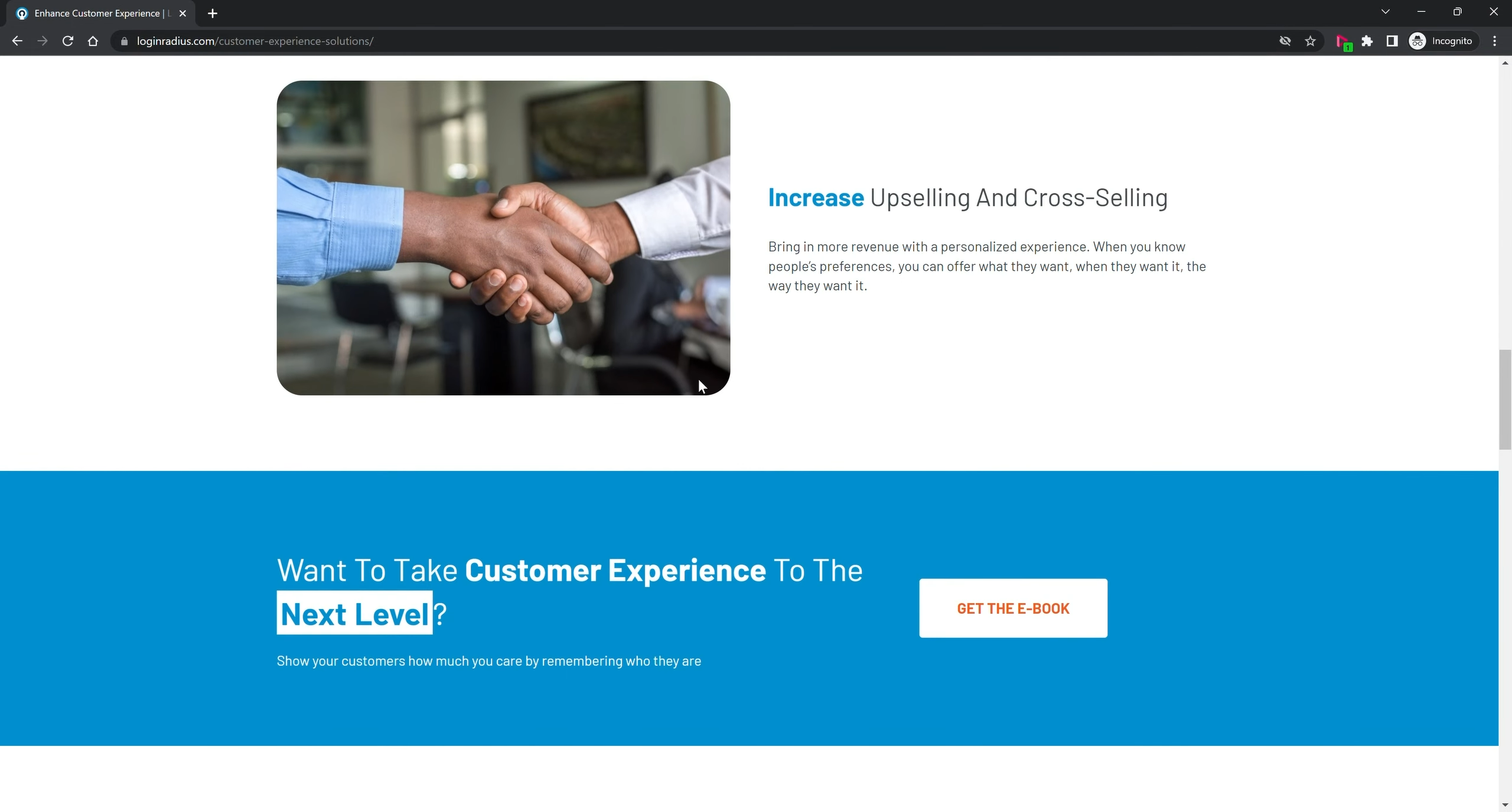
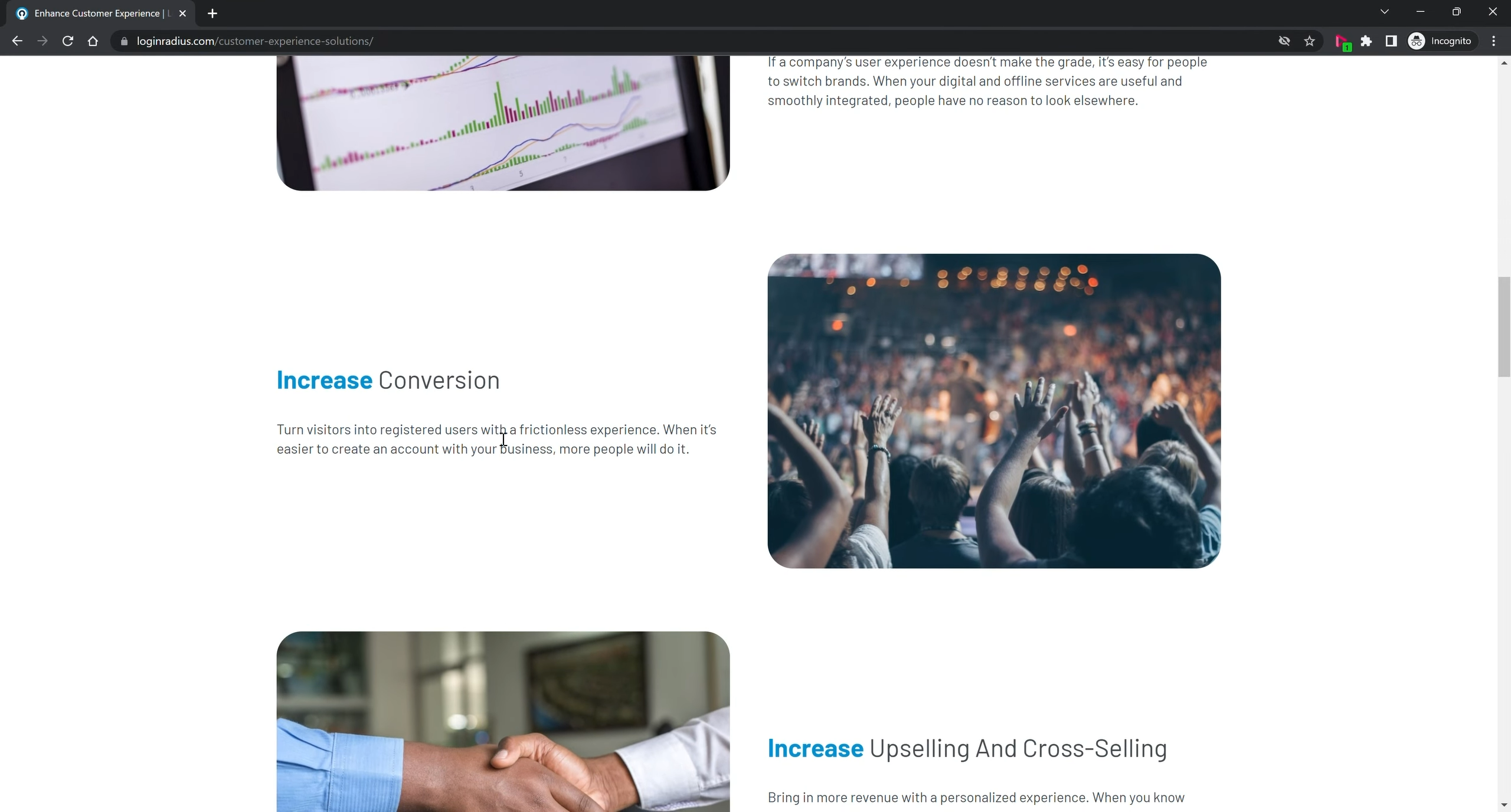
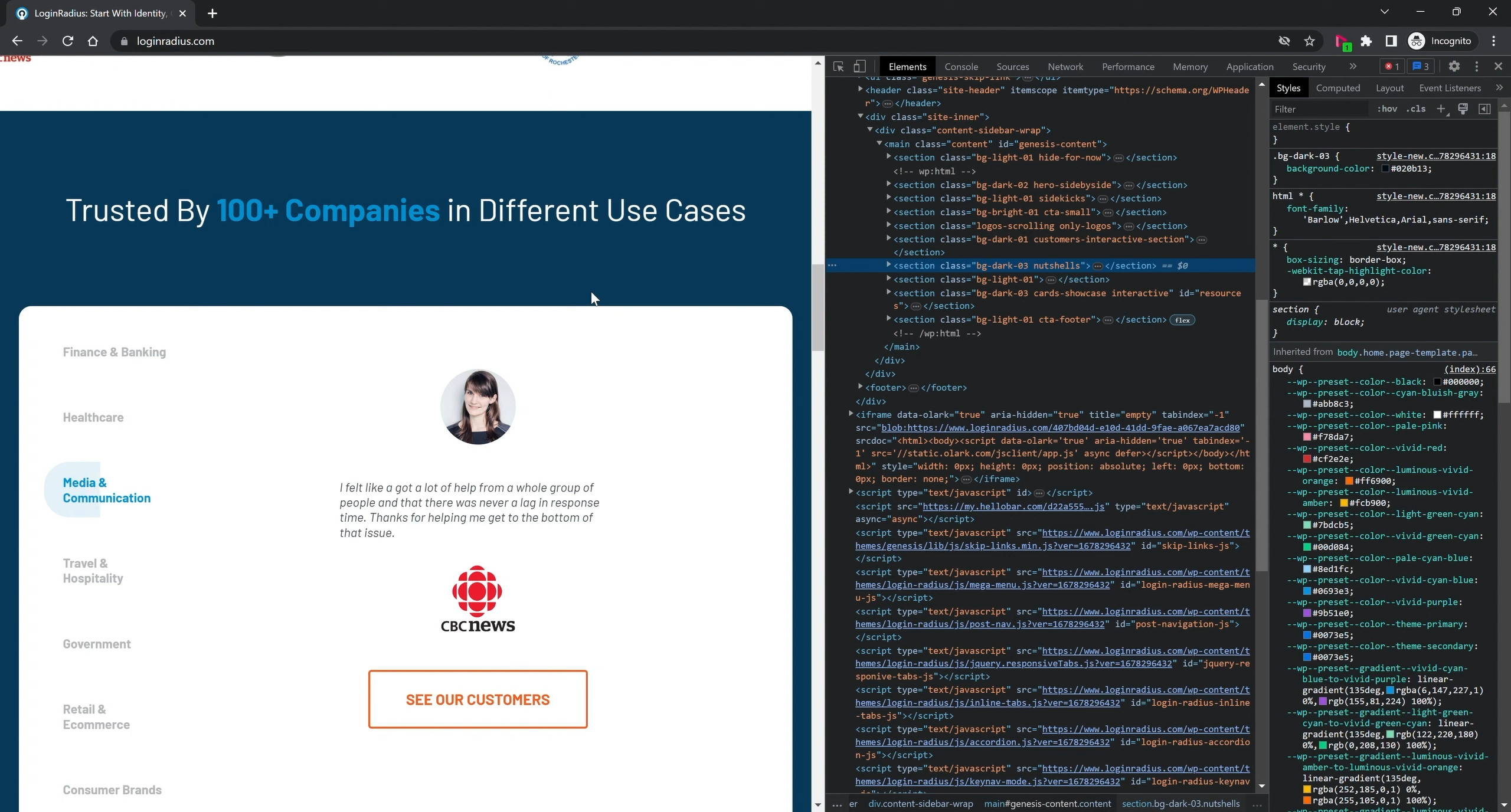
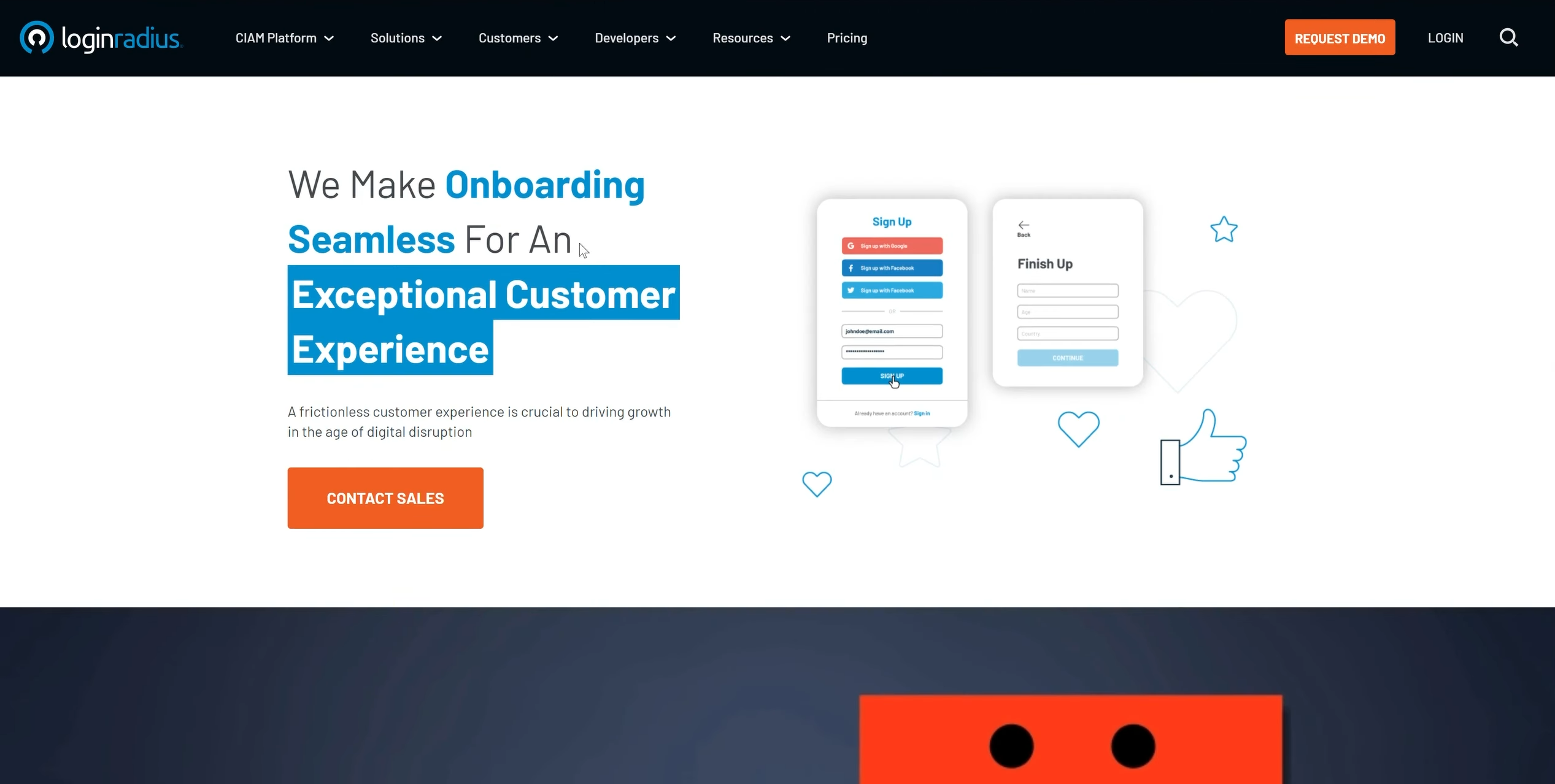
LoginRadius.com Screenshot

LoginRadius Corporate Web Architecture

Re-architecting a global cybersecurity marketing engine through a modular design system and hand-crafted front-end code.

  • Employer: LoginRadius Inc.
  • Role: Design Department Manager / Principal Growth Designer & Front-End Developer
  • Scope: End-to-End Web Overhaul, Systemic Problem Discovery, Component-Driven Design System, Information Architecture, Production Front-End Engineering, SEO & Performance Optimization
  • Tech Stack: WordPress, HTML5, PHP, JavaScript (jQuery), CSS/LESS
  • Domain: Enterprise Cybersecurity / CIAM (Customer Identity and Access Management) B2B SaaS
  • Collaboration: CEO, Executive Leadership, Marketing Department

Executive Summary

LoginRadius is a global Customer Identity and Access Management (CIAM) platform that requires a digital presence capable of commanding immediate technical authority and enterprise trust. However, the legacy corporate website suffered from severe visual fragmentation, high bounce rates, and a bloated codebase that slowed down both page load speeds and the marketing team's ability to launch new campaigns.

Reporting directly to the CEO and operating as the lead architect and front-end developer for the overhaul, I investigated the root causes stalling marketing velocity and buyer conversion. By replacing one-off page layouts and heavy third-party plugins with a unified, component-driven design system and lightweight production code (HTML5, PHP, CSS/LESS, JavaScript), I transformed LoginRadius.com into a high-performance conversion engine. The overhaul accelerated new page deployment speeds by over 6x, enabled a 48-hour turnaround SLA for marketing outreach, and increased conversion rates across core landing pages by 15%.

1. Problem Discovery: Investigating the Root Bottlenecks

When aligning with the CEO and Marketing leadership on company KPIs, the surface-level request was to modernize the look and feel of LoginRadius.com. Rather than treating the project as a purely visual rebrand, I audited both external buyer behavior (analytics, bounce rates, and reading patterns) and internal publishing workflows (the codebase and how long it took to ship a new campaign page).

What the Investigation Revealed:

  • The Dual-Persona Scanning Disconnect: A cybersecurity B2B website must serve two vastly different buyers simultaneously: executive decision-makers (CISOs, CTOs) who scan pages in seconds looking for ROI and compliance trust signals, and technical evaluators (developers, security architects) who hunt for deep implementation capabilities. Auditing existing pages revealed flat typographic hierarchies that forced both groups to wade through dense walls of text—leading to high bounce rates before users ever reached a call-to-action.
  • One-Off Layouts Stalling Marketing Velocity: Looking into why marketing campaigns took so long to launch exposed a major architectural flaw. The legacy site lacked a reusable component system; every landing page had been built as a custom, isolated layout. Launching a new campaign required rebuilding HTML and CSS from scratch, creating a massive bottleneck for marketing outreach.
  • Plugin Bloat & Distracting Motion Hurting SEO: Inspecting the front-end repository revealed layers of redundant CSS, bloated third-party WordPress plugins, and heavy, unanchored animations. Instead of making the brand feel modern, these heavy scripts degraded page load speeds, hurt technical SEO rankings, and distracted users from the core value proposition.

2. Problem Identification: The Systemic Diagnosis

Synthesizing findings from conversion analytics, marketing workflows, and code audits allowed me to isolate four root systemic problems that the overhaul needed to solve:

  1. High Bounce Rates from Poor Visual Hierarchy: B2B buyers do not read landing pages word-for-word—they scan. The legacy UI lacked the typographic scale, contrast ratios, and visual anchors required to stop a scanning executive's eye on key value metrics and CTAs.
  2. Rigid, Non-Reusable Page Architecture: Because design elements were hardcoded per page rather than systematized as modular components, building new landing pages or updating global messaging was slow, error-prone, and difficult to maintain.
  3. Frontend Performance & SEO Degradation: Redundant HTML/CSS and reliance on third-party plugins inflated DOM size and slowed down time-to-interactive, directly penalizing organic search visibility and paid campaign conversion rates.
  4. Eroded Enterprise Trust: In the cybersecurity and identity sector, a sluggish, visually inconsistent website subconsciously signals technical fragility—undermining buyer confidence in the security of the underlying CIAM platform.

3. Approach & Architectural Solutions

Full-Stack Design-to-Code Execution

To eliminate the translation gap between design and engineering—and guarantee peak browser performance—I executed the overhaul end-to-end across both Figma and the production codebase:

  • Zero-Plugin Hand-Crafted Code: Instead of relying on bloated page-builder plugins that slow down WordPress environments, I hand-wrote clean, semantic HTML5, PHP templates, modular LESS stylesheets, and lightweight JavaScript.
  • KPI-Driven Iteration with Leadership: Working directly with the CEO and Marketing leads, I prioritized high-traffic conversion pathways first, continuously measuring how layout, contrast, and load-speed improvements impacted lead generation.

The 3 Pillars of the New LoginRadius.com Architecture

Pillar 1: Modular Design System & Reusable PHP/LESS Component Library

  • The Diagnosis Addressed: Fragmented, one-off page layouts created visual debt, bloated CSS, and severe delays when launching new marketing pages.
  • The Architectural Solution: I architected a comprehensive, component-driven web design system from the ground up. By designing a versatile library of reusable UI blocks in Figma and coding them directly into modular PHP and LESS templates, I established a single source of truth across the entire site. Marketing pages could now be assembled rapidly by mixing and matching pre-tested, responsive components—ensuring 100% brand consistency while slashing development overhead.

Pillar 2: Scan-Optimized Typographic Hierarchy & Conversion Anchors

  • The Diagnosis Addressed: Both CISOs and developers were bouncing from dense pages because core value propositions and CTAs blended into the background.
  • The Architectural Solution: I re-engineered the visual hierarchy around natural B2B eye-scanning patterns. I introduced a high-contrast typographic scale, strict WCAG-compliant color pairings, and structured content grids that selectively "punch out" critical security statistics, architectural benefits, and primary CTAs. This allowed executives to grasp business value in seconds while giving technical buyers clear pathways to deeper documentation.

Pillar 3: Performance-Engineered Motion & Codebase Refactoring

  • The Diagnosis Addressed: Dated visuals paired with heavy, abstract animations slowed down page loads and interrupted user navigation.
  • The Architectural Solution: I stripped out redundant stylesheets and heavy scripts, replacing them with a clean, minimalist grid aesthetic anchored by generous whitespace. To modernize the brand without sacrificing speed, I coded subtle, hardware-accelerated micro-interactions used strictly to guide the user's eye down the conversion funnel—enhancing technical storytelling while drastically improving overall site stability and page load speeds.

4. The Impact: Measured Against the Diagnosis

By combining systems-level UX architecture with direct front-end engineering, the LoginRadius.com overhaul delivered immediate, measurable ROI for executive leadership and the marketing organization:

Root Problem #1:

Slow, manual creation of new marketing pages.
Architectural Intervention:

Architected a modular design system and reusable PHP/LESS component library.

Measurable Impact:

Accelerated new page deployment speed by over 6x and enabled a 48-hour asset turnaround for marketing outreach.

Root Problem #2:

High bounce rates among scanning B2B buyers.

Architectural Intervention:

Rebuilt typographic hierarchy, contrast ratios, and scan-optimized CTA placement.

Measurable Impact:

Increased conversion rates by ~15% across multiple core landing pages.

Root Problem #3:

Bloated code & plugins hurting site speed and SEO.

Architectural Intervention:

Stripped out third-party bloat and hand-coded semantic HTML5, LESS, and JS.

Measurable Impact:

Significantly improved page load speeds, SEO performance, and overall website stability.

Root Problem #4:

Dated brand presence undermining security authority.

Architectural Intervention:

Unified the visual language with crisp layouts and purposeful, lightweight motion.

Measurable Impact:

Elevated enterprise credibility with CISOs and CTOs, aligning the web experience with the security of the core CIAM product.

Table of Contents

Screenshot Screenshot

Featured Case Study

Lost in Fragmented Systems?

See how I designed a unified 0-to-1 grant management platform for the BC Government, replacing fragmented manual workflows with a modern web experience

View Unity Case Study