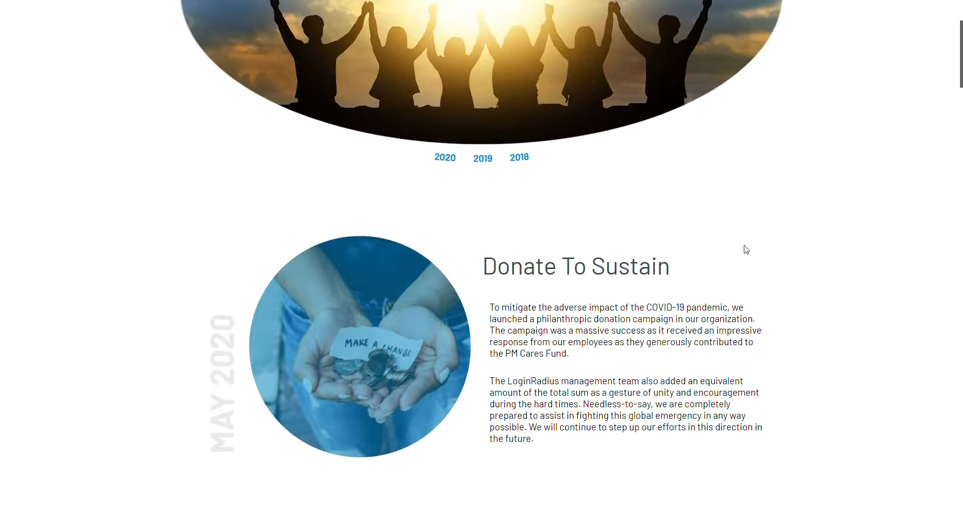
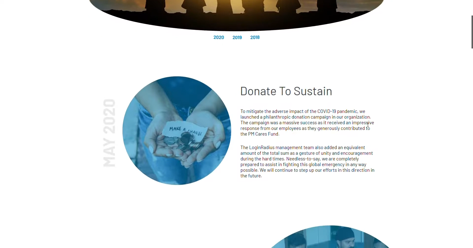
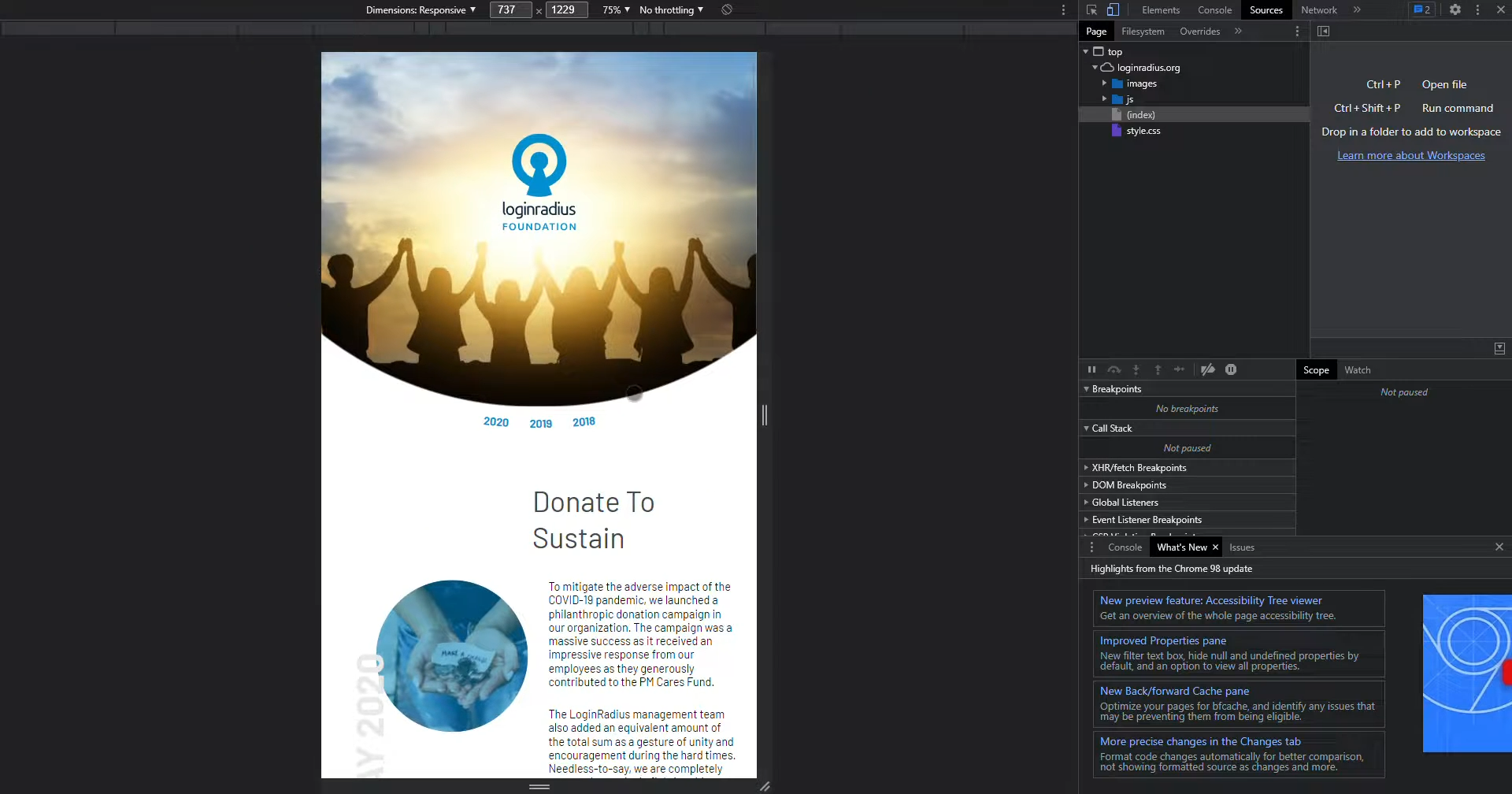
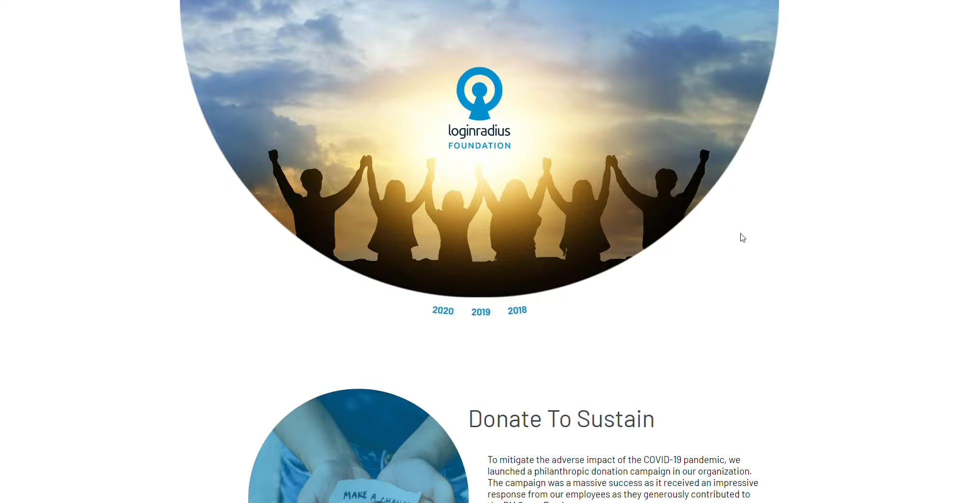
LoginRadius.org Screenshot

LoginRadius Org Website & Community Brand

Engineering an experiential corporate social responsibility (CSR) web platform through scroll-state motion choreography and zero-library front-end code.

  • Employer: LoginRadius Inc.
  • Role: Principal Digital Designer & Interactive Front-End Developer (Solo End-to-End Execution)
  • Scope: 0-to-1 Community Sub-Brand Strategy, Website UX/UI Architecture, Scroll-State Motion Choreography, Responsive Front-End Engineering
  • Tech Stack: PHP, Vanilla JavaScript (Custom Scroll-State Listener), HTML5, CSS/SASS (Custom Keyframes)
  • Domain: Corporate Social Responsibility (CSR), Employer Branding & Community Outreach Web Platform
  • Collaboration: Direct partnership with the CEO & Executive Leadership

Executive Summary

To amplify its community outreach, philanthropic initiatives, and employer brand equity, LoginRadius executive leadership initiated LoginRadius Org—a dedicated web platform built to showcase the human side of the company. However, building a storytelling-driven community website presented a classic UX paradox: standard corporate layouts feel too sterile to convey human warmth, while heavily animated "experiential" websites frequently suffer from motion fatigue, poor readability, and sluggish performance.

Operating as the sole designer and front-end web developer in direct collaboration with the CEO, I owned the 0-to-1 brand translation, UX architecture, and production codebase. By investigating the cognitive friction between web motion and human reading mechanics, I engineered a custom, state-driven JavaScript scroll listener paired with native SASS keyframe animations. The resulting platform delivered an immersive, high-frame-rate storytelling experience that automatically pauses motion the instant a user stops to read—achieving rich visual delight without sacrificing usability or page speed.

1. Problem Discovery: Investigating the Root Bottlenecks

When tasked by the CEO to create an engaging digital home for LoginRadius's community initiatives, I audited how modern experiential and CSR websites handle visual storytelling across desktop and mobile devices.

What the Investigation Revealed:

  • The "Eye-Candy vs. Readability" Paradox: Auditing award-winning experiential websites revealed a pervasive usability failure: kinetic typography and looping background animations look impressive during a quick skim, but when a user actually tries to read an article or event summary, continuous peripheral motion creates severe cognitive strain and breaks eye-tracking patterns.
  • The Cold B2B Grid Trap: Conversely, looking at standard corporate CSR pages showed that dropping photos of volunteer work into rigid, sharp-cornered enterprise B2B templates makes human-centric stories feel sterile, transactional, and uninspiring.
  • Fragmented Cross-Device Navigation & Library Bloat: Investigating how interactive micro-sites behave on mobile devices exposed disjointed navigation menus that felt bolted-on rather than native to the layout, alongside heavy reliance on external JavaScript animation libraries that delayed initial page rendering.

2. Problem Identification: The Systemic Diagnosis

Synthesizing findings from cognitive reading mechanics, brand psychology, and front-end browser performance allowed me to diagnose four root problems the website architecture needed to solve:

  1. Cognitive Overload from Uncontrolled Motion: Animations that trigger or loop while a user's eyes are stationary compete for visual attention, causing motion fatigue and degrading content comprehension.
  2. Sterile Enterprise Visual Language: The core cybersecurity brand relied on sharp, technical layouts that failed to communicate empathy, unity, and community warmth.
  3. Disjointed Desktop-to-Mobile Navigation Ergonomics: Traditional responsive headers often sever the visual connection between desktop and mobile views, breaking spatial continuity across form factors.
  4. Performance Penalties from Third-Party Motion Frameworks: Relying on heavy external animation libraries to orchestrate scroll effects bloats bundle sizes and introduces frame-rate drops on lower-powered mobile devices.

3. Approach & Architectural Solutions

Uniting Behavioral UX with Hand-Crafted Front-End Code

Because the success of an interactive storytelling site depends entirely on how it feels in the browser, static design mockups were not enough. I approached the build by merging UX psychology directly with production code:

  • State-Driven Motion Governance: I established a strict architectural rule for the site: motion should propel transitions, never compete with comprehension.
  • Zero-Library Native Engineering: To guarantee instant load times and silky-smooth rendering across all devices, I bypassed third-party animation frameworks entirely—hand-coding the platform in PHP, vanilla JavaScript, and custom SASS keyframes.

The 3 Pillars of the LoginRadius Org Website Architecture

Pillar 1: Scroll-Aware, State-Driven Animation Engine (UX & JS)

  • The Diagnosis Addressed: Continuous or poorly timed text and layout animations disrupt reading comprehension and cause cognitive strain.
  • The Architectural Solution: I engineered a custom, scroll-aware JavaScript event listener that dynamically governs CSS animation states based on real-time user behavior. As the user actively scrolls through a story section, typography and layout elements respond with fluid, kinetic entry animations that create a sense of forward momentum. However, the exact millisecond the user stops scrolling to read, all motion instantly stops—guaranteeing a calm, high-contrast, distraction-free reading environment.

Pillar 2: Symbolic Circular-to-Linear Adaptive Navigation (UI)

  • The Diagnosis Addressed: Standard navigation bars feel disconnected from storytelling layouts and break consistency between desktop and mobile ergonomics.
  • The Architectural Solution: Drawing from the circular geometry of the LoginRadius identity—symbolizing unity and community—I designed an adaptive navigation component that begins as a minimal circular anchor point. Upon interaction, it fluidly morphs into a clean, full-width navigation bar. This unified component scales effortlessly from widescreen desktop monitors down to a thumb-friendly, accessible touch target on mobile screens.

Pillar 3: Human-Centric Geometric Metaphors & Layout System

  • The Diagnosis Addressed: Standard rectangular photo grids make community and volunteer galleries feel cold and corporate.
  • The Architectural Solution: I replaced rigid B2B box grids with a soft, human-centric layout system anchored by circular image masking and generous whitespace. The recurring circular motifs act as a cohesive visual metaphor for community loops and interconnectedness—transforming massive photo galleries and event logs into an inviting, editorial narrative.

4. The Impact: Measured Against the Diagnosis

By controlling both the UX choreography and the underlying PHP/JS/SASS codebase, the LoginRadius Org website proved that rich experiential storytelling and strict usability can coexist:

Root Problem #1:

Motion fatigue & disrupted reading comprehension.
Architectural Intervention:

Engineered a custom vanilla JS scroll listener that pauses animations the instant scrolling stops.

Measurable Impact:

Eliminated peripheral motion distraction during reading while preserving dynamic visual momentum during scroll transitions.

Root Problem #2:

Cold, corporate B2B layouts clashing with CSR mission.

Architectural Intervention:

Architected a soft, circular geometric design language symbolizing unity and community loops.

Measurable Impact:

Elevated employer brand equity and community outreach with a warm, human-centric digital identity.

Root Problem #3:

Disjointed desktop vs. mobile navigation UX.

Architectural Intervention:

Designed and coded a morphing circular-to-linear responsive navigation system.

Measurable Impact:

Delivered seamless cross-device ergonomics and intuitive thumb-zone accessibility on mobile.

Root Problem #4:

Slow page loads from heavy animation libraries.

Architectural Intervention:

Hand-crafted all motion using native CSS/SASS keyframes and lightweight vanilla JS.

Measurable Impact:

Achieved lightning-fast page load speeds and 60fps rendering with zero external animation dependencies.

Table of Contents

Screenshot Screenshot

Featured Case Study

Lost in Fragmented Systems?

See how I designed a unified 0-to-1 grant management platform for the BC Government, replacing fragmented manual workflows with a modern web experience

View Unity Case Study