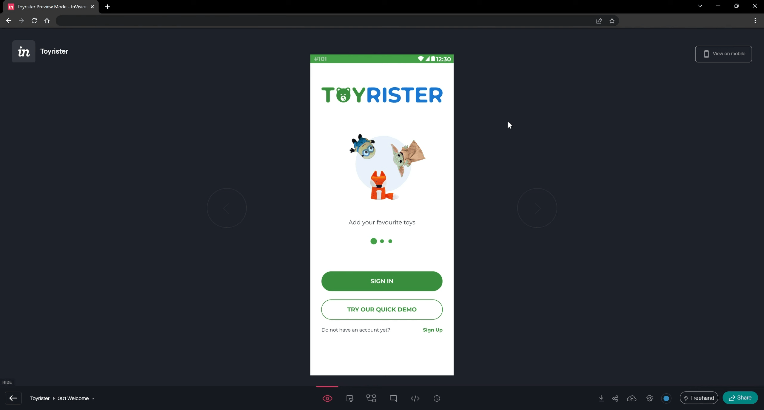
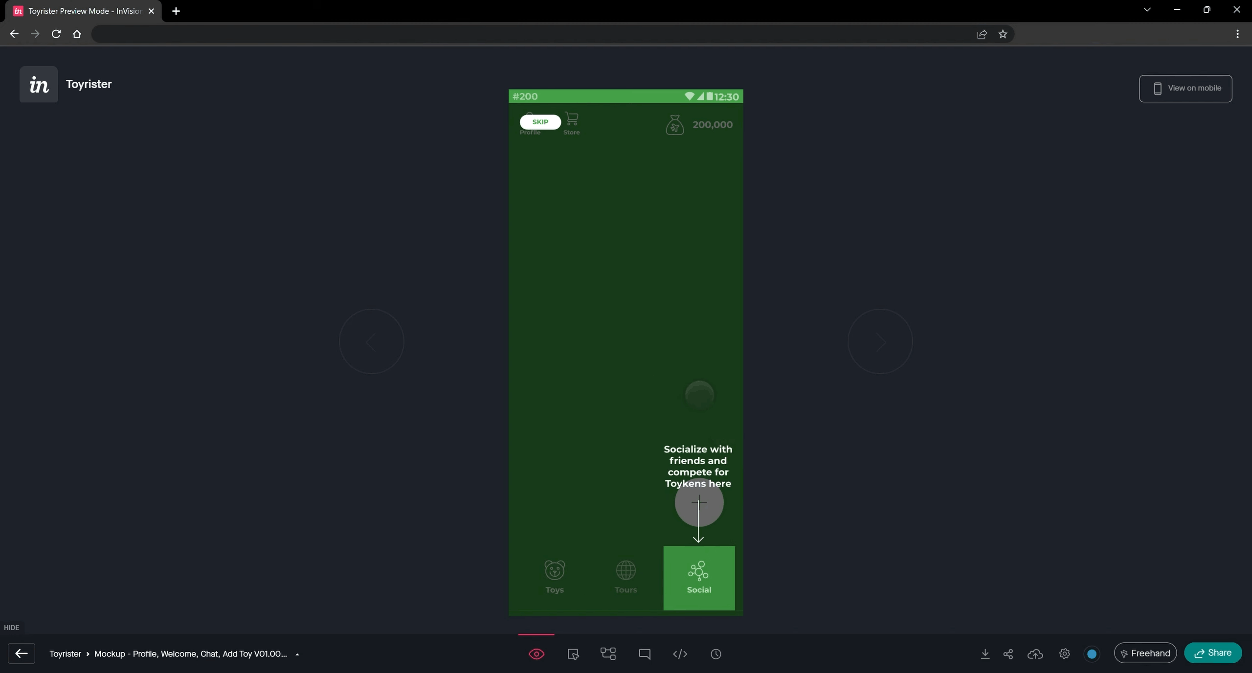
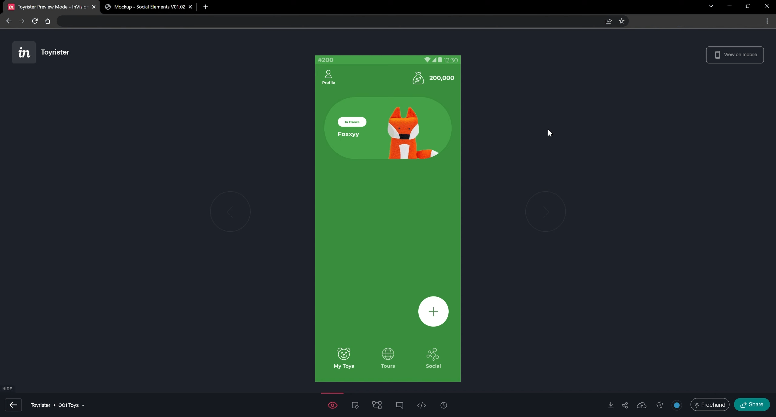
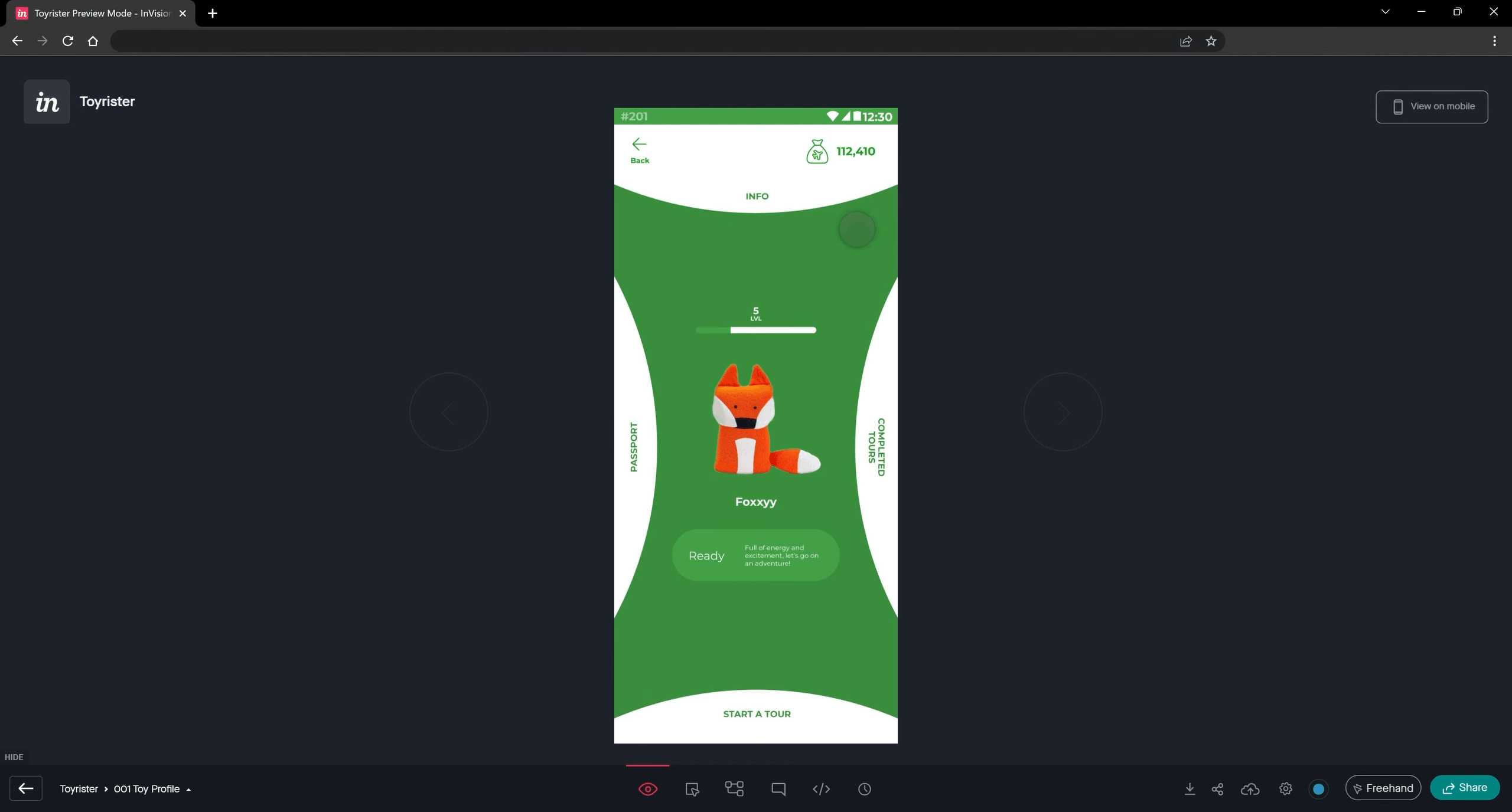
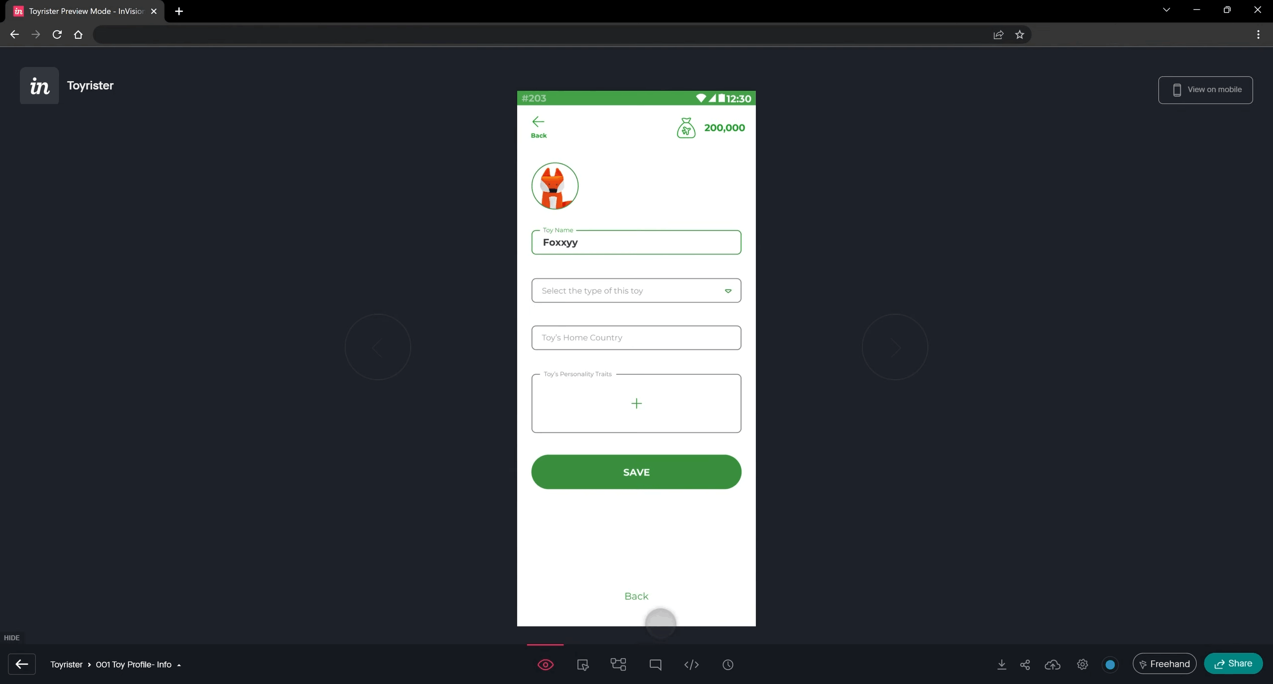
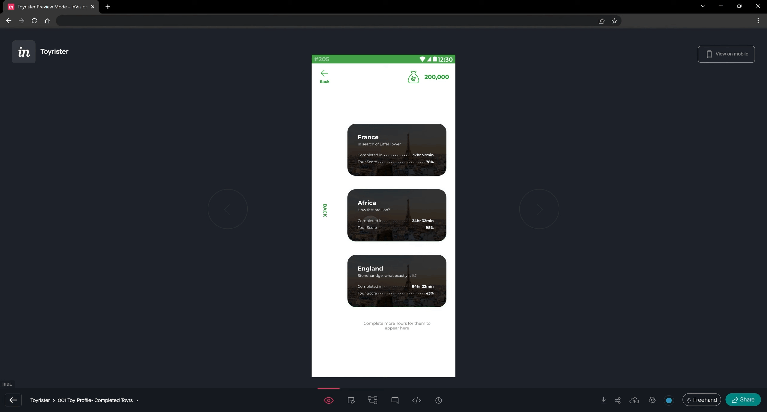
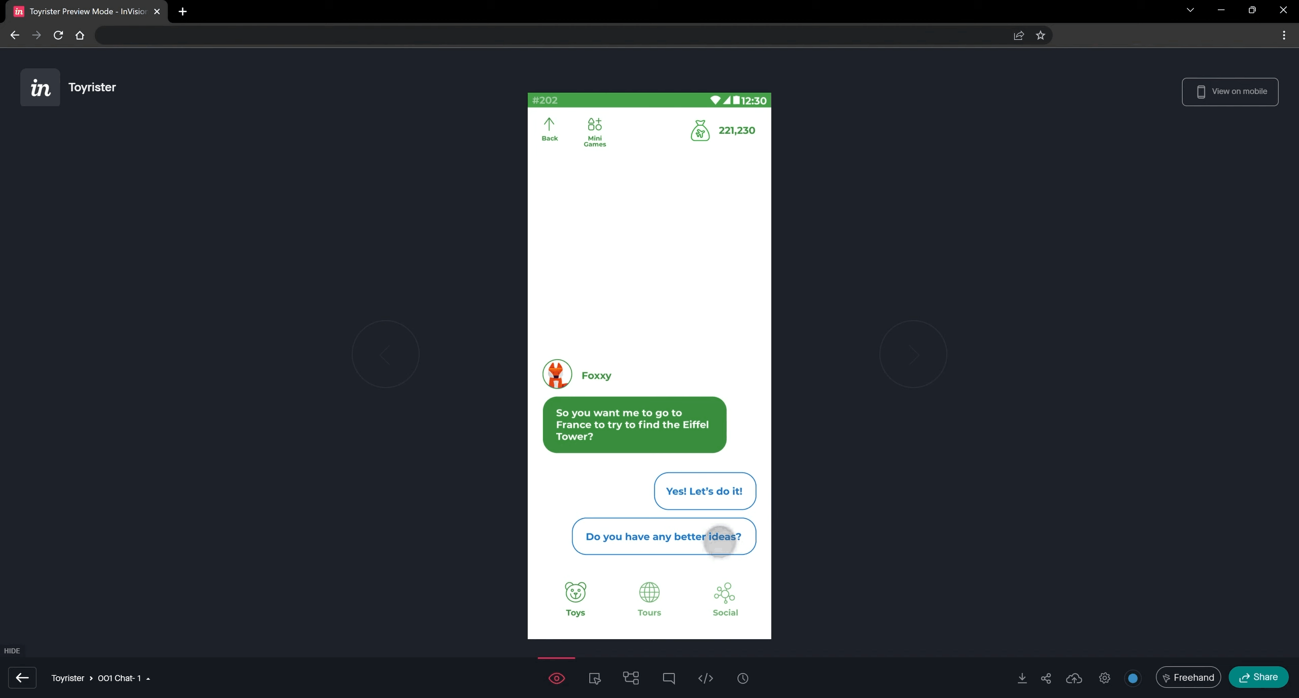
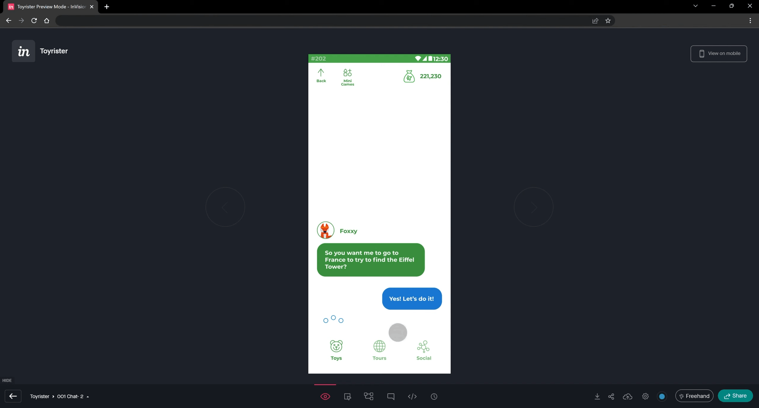
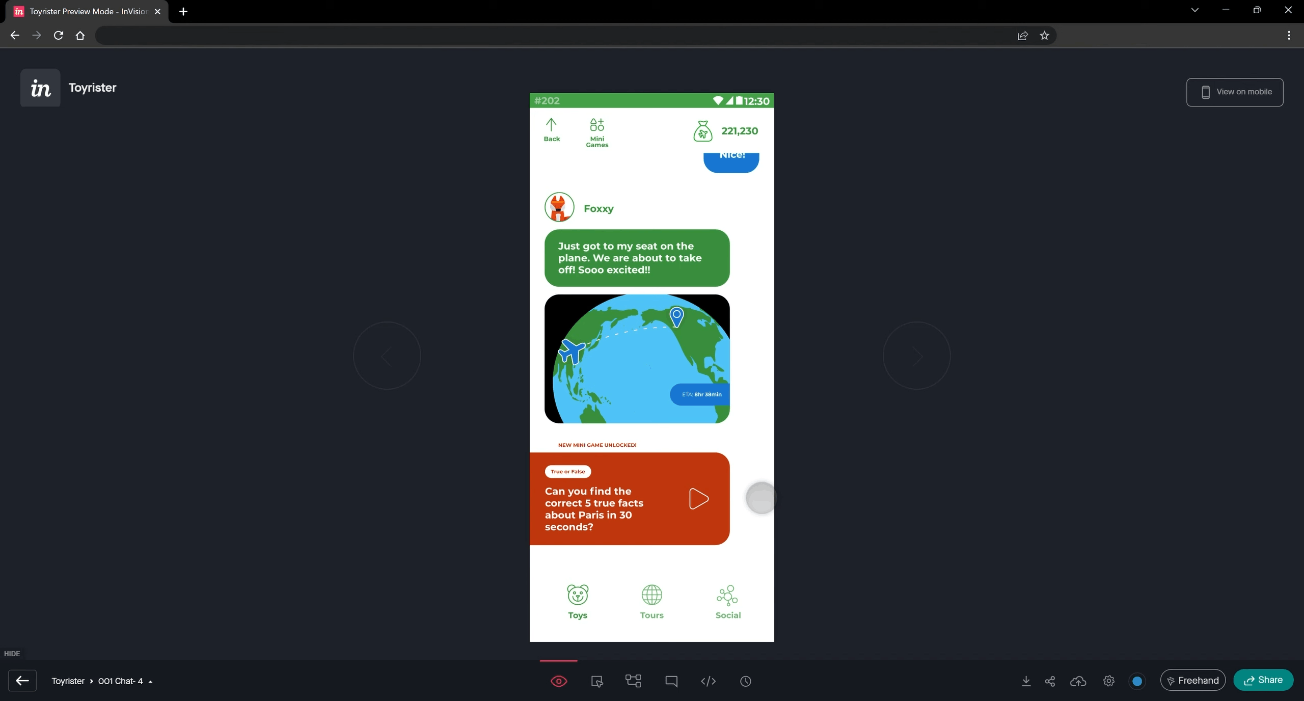
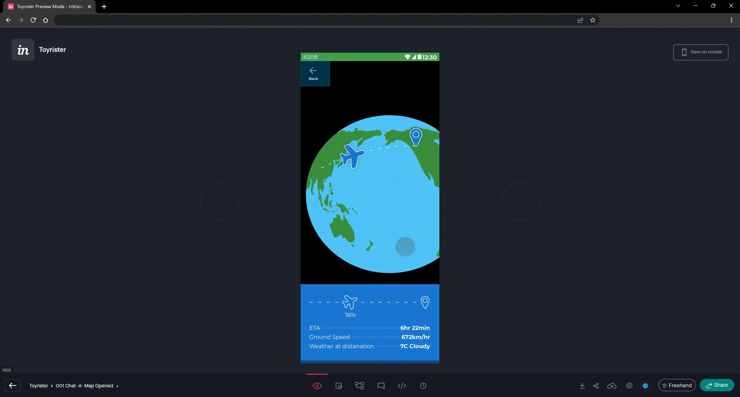
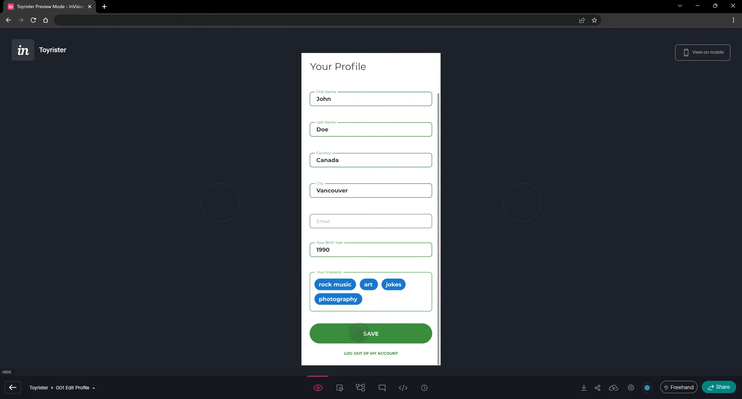
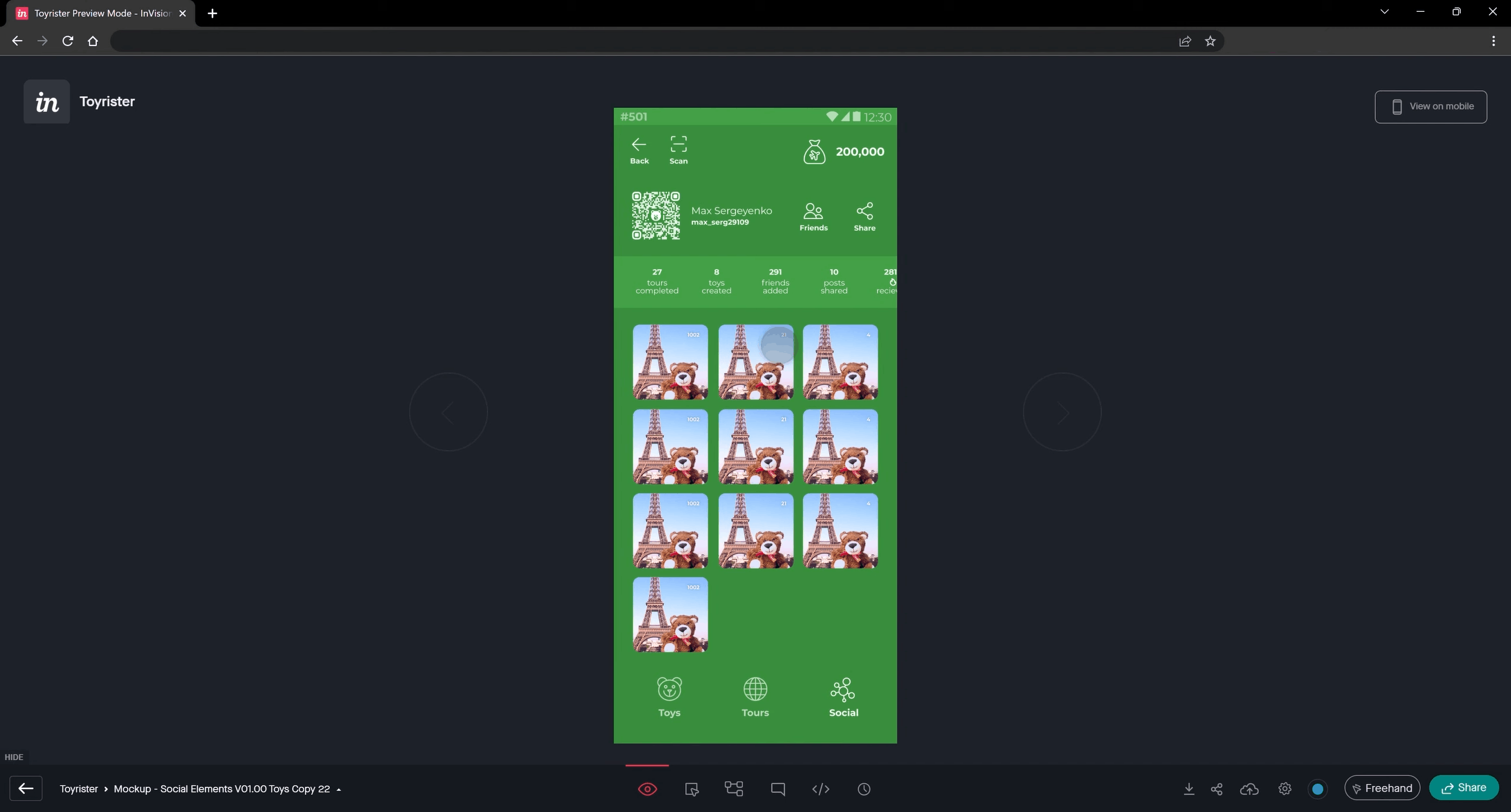
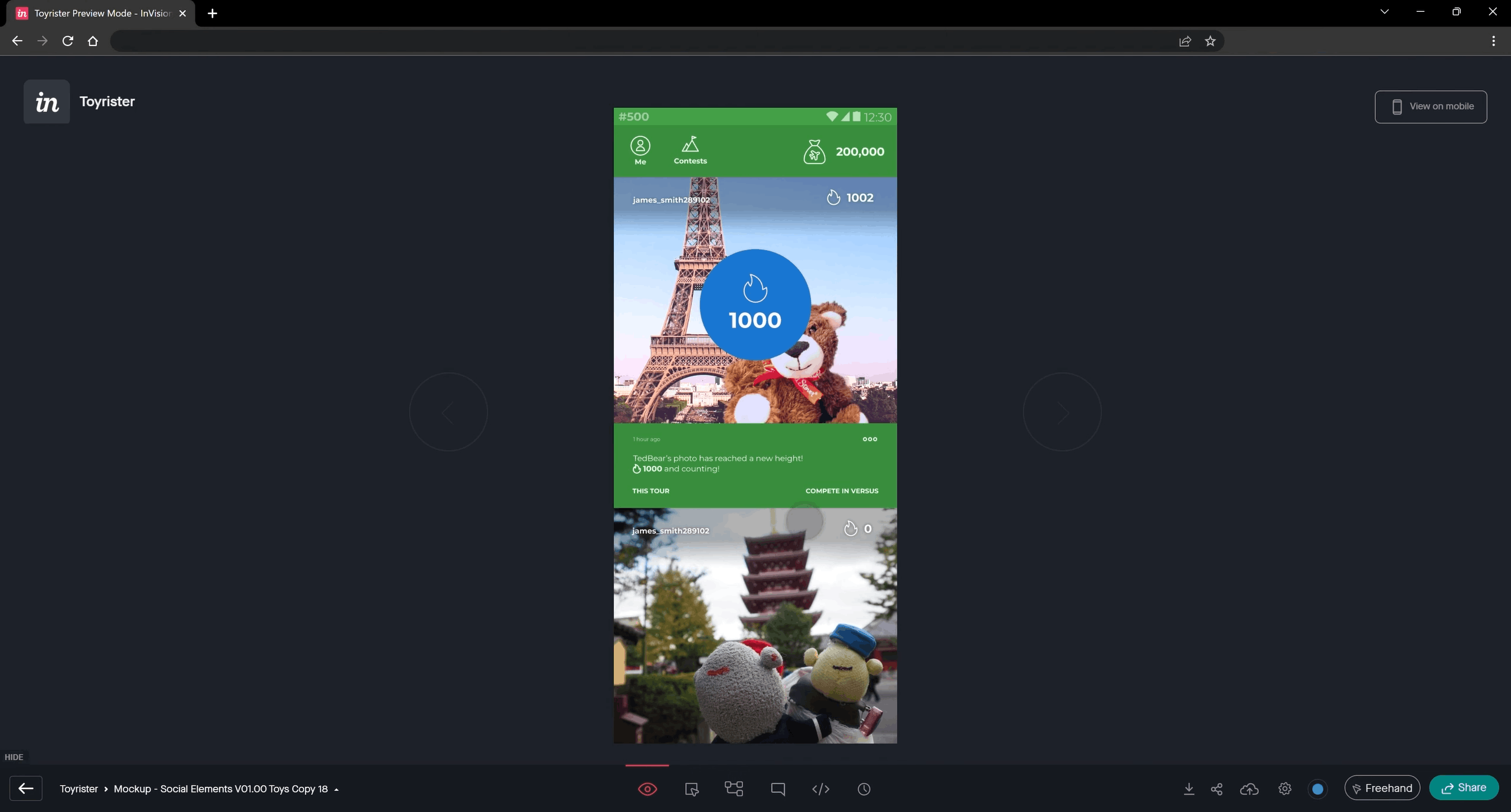
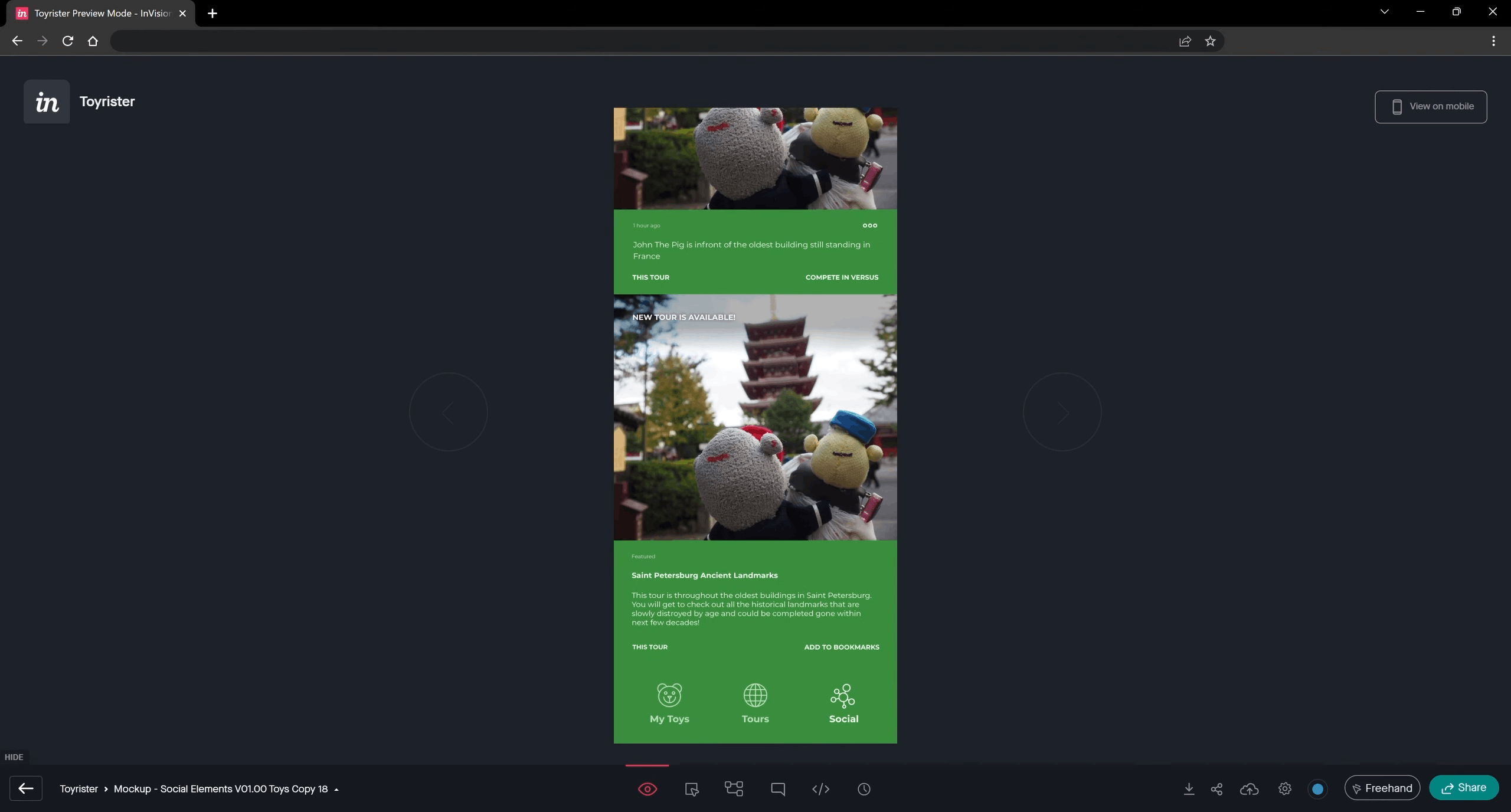
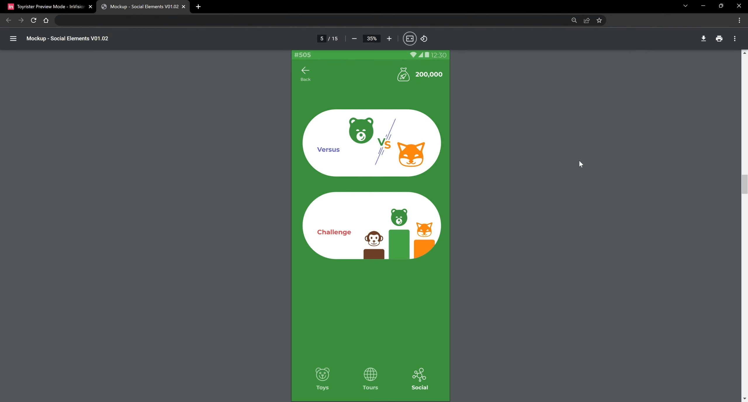
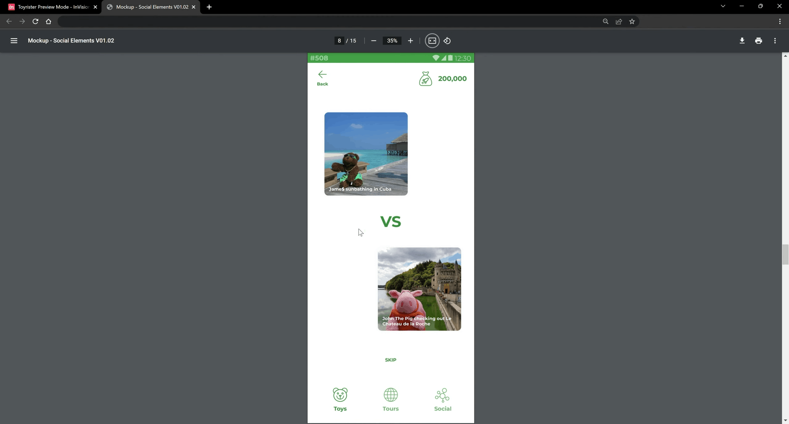
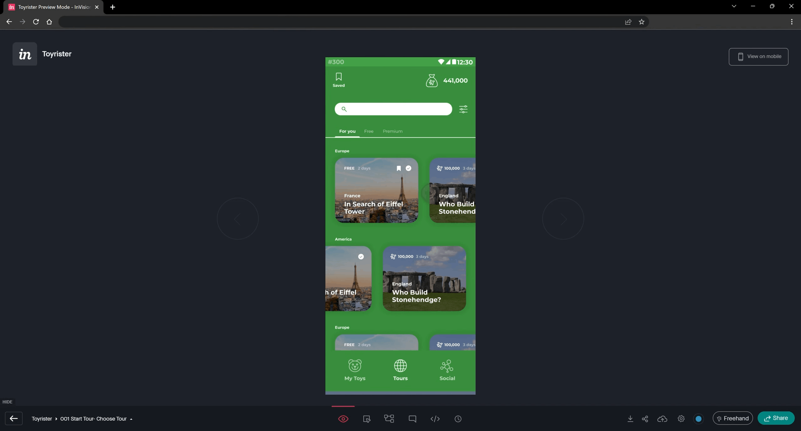
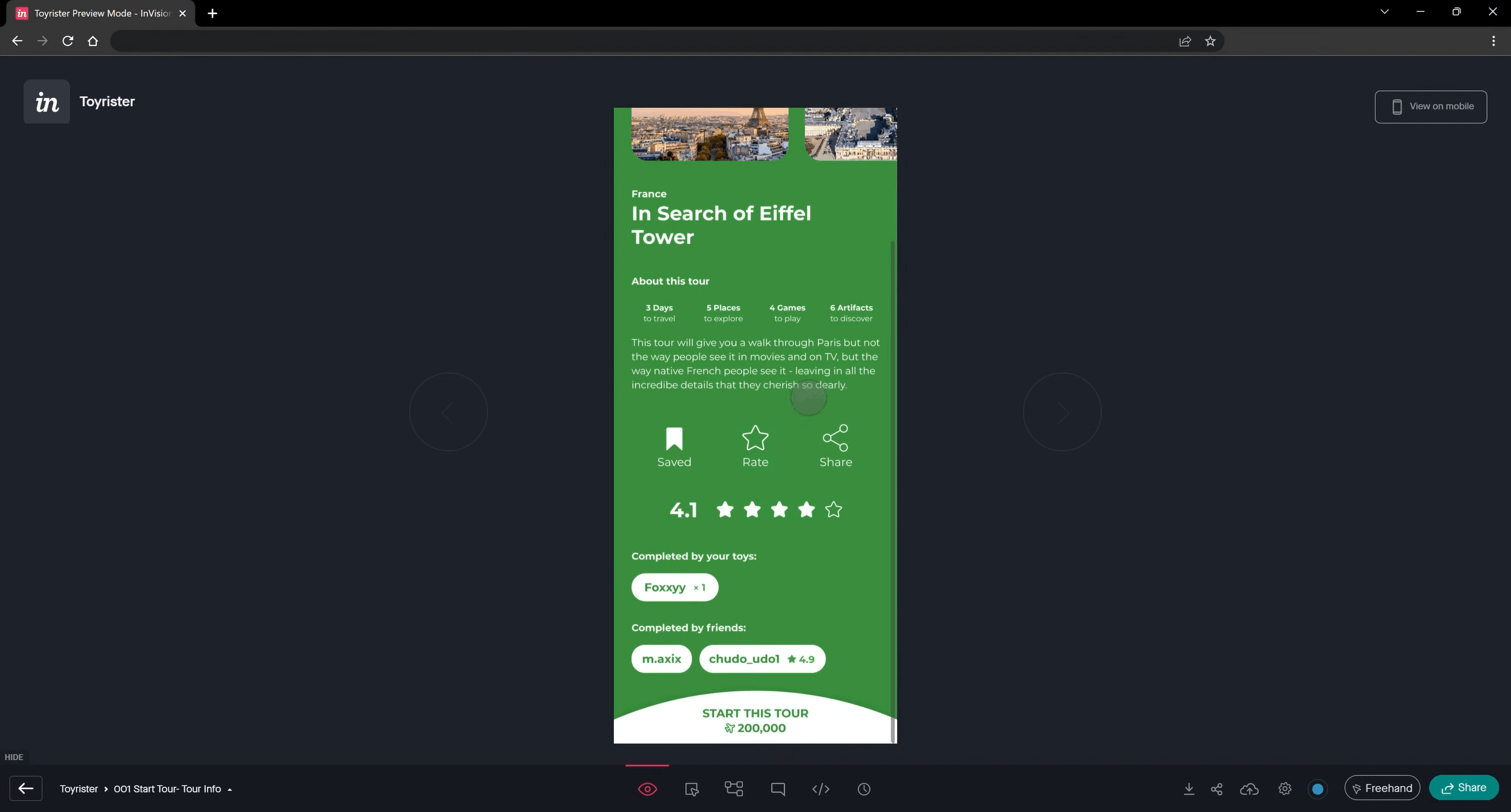
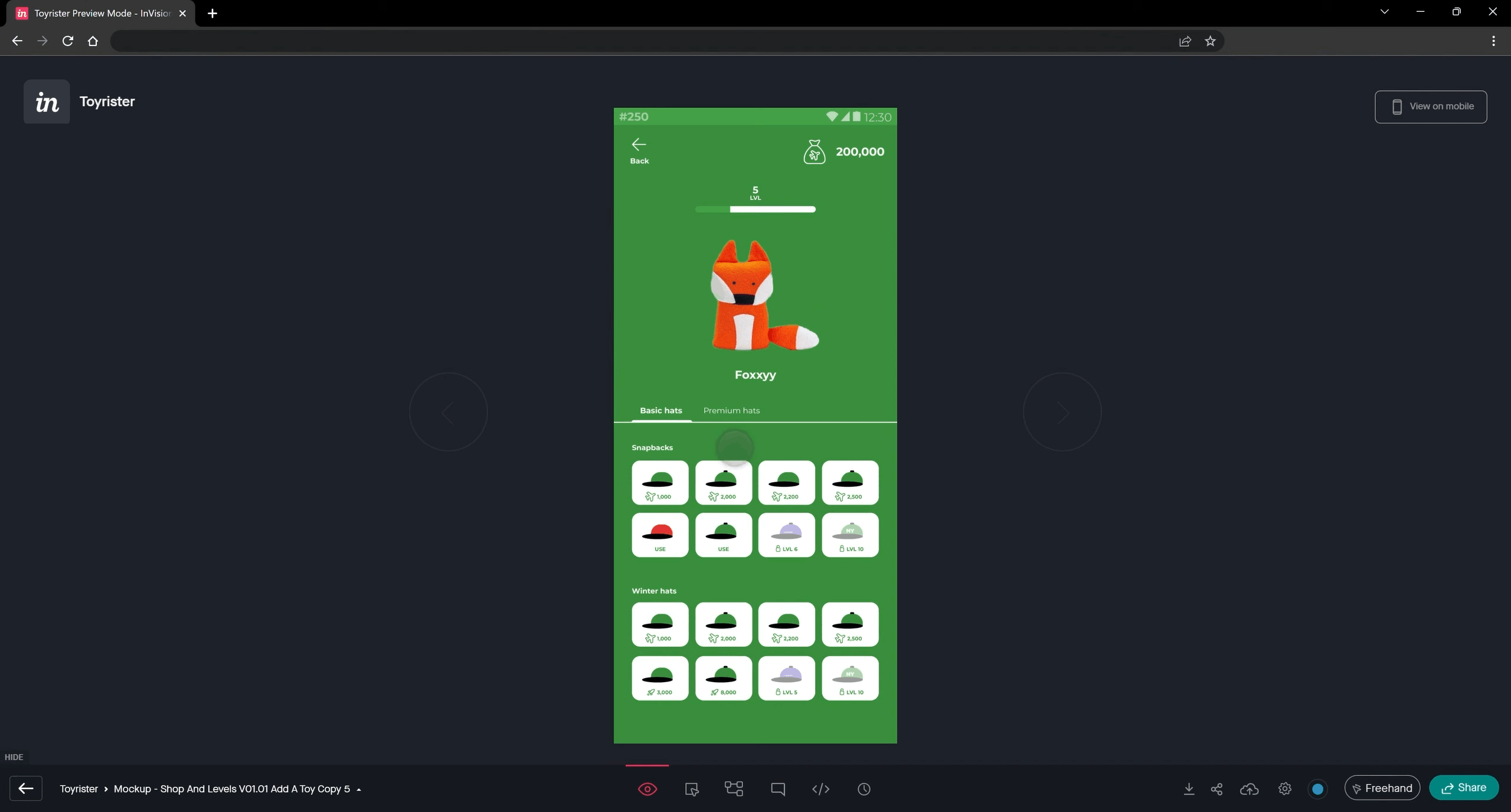
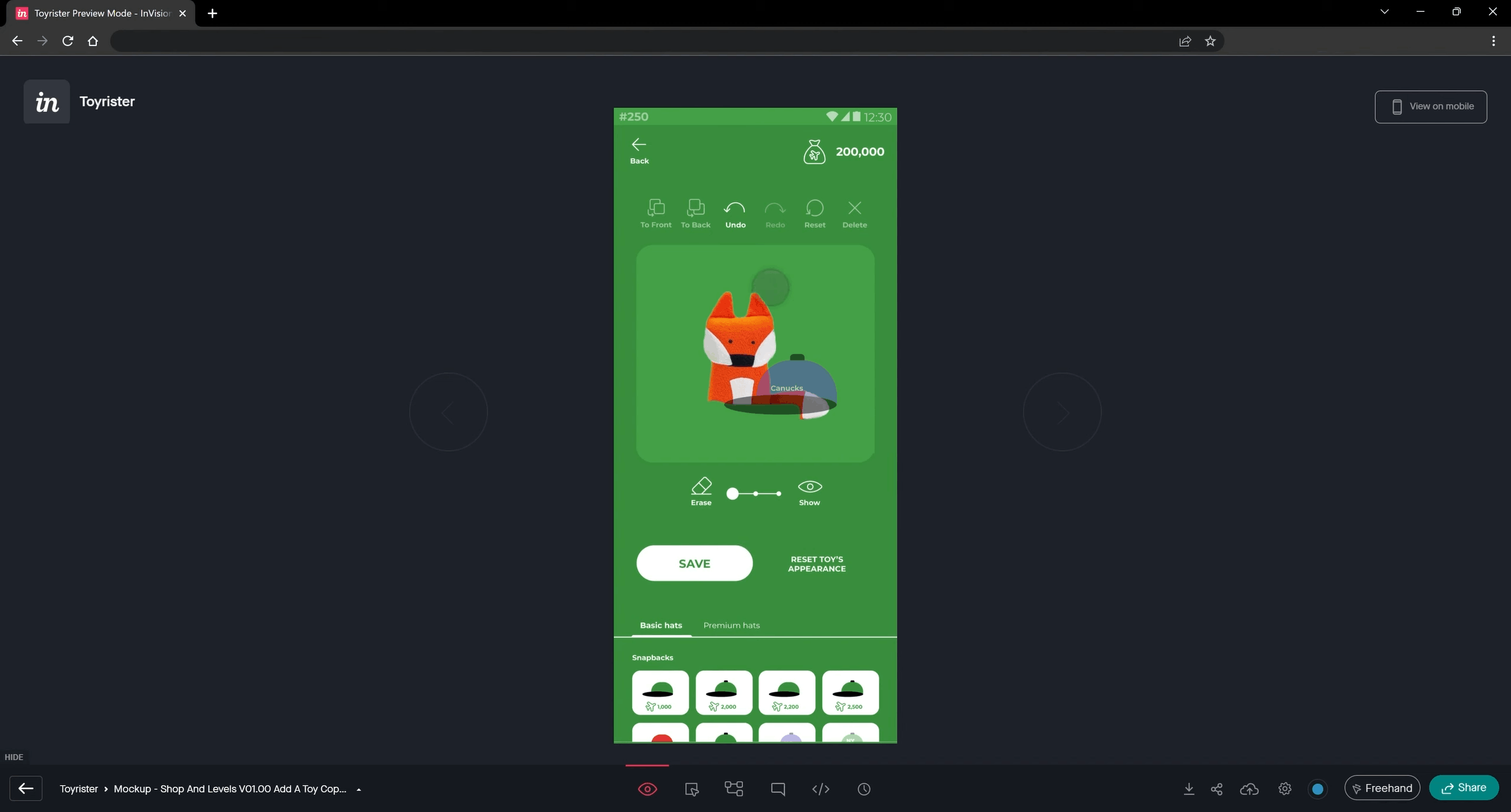
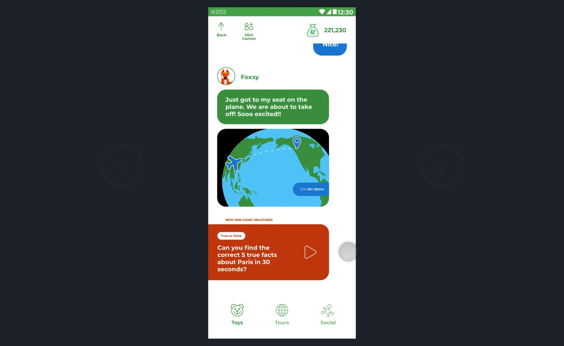
Toyrister Screenshot

Toyrister Mobile Platform

Translating raw founder concepts into a 0-to-1 gamified travel discovery app and production-ready React Native component architecture.

  • Employer: Toyrister
  • Role: Lead Product / Mobile UX Designer & Front-End UI Developer
  • Scope: 0-to-1 Product Strategy, Systemic Problem Discovery, Mobile Information Architecture, Gamification & Retention Loops, Interactive Prototyping, Front-End Component Styling
  • Tech Stack: React Native, CSS/SASS
  • Domain: Gamified Social Media, Virtual AI Companionship, TravelTech & Family Local Discovery (B2C Mobile)
  • Collaboration: App Founders, Early-Stage Stakeholders, Mobile Engineering Team

Executive Summary

Toyrister is a 0-to-1 gamified social media, virtual AI companionship, and local travel discovery mobile application designed primarily for children—while remaining engaging and accessible for adults and families. Brought in during the raw inception phase, I partnered directly with the founding team to turn an ambitious, multi-faceted concept into a structured, build-ready mobile product.

Rather than simply skinning the founders' initial ideas, I investigated the behavioral mechanics required to keep a young and multi-generational audience engaged daily. After diagnosing critical gaps in feature hierarchy and retention loops, I re-architected the mobile user journey, proactively expanded the product scope with net-new gamified workflows, validated multi-screen transition states through an end-to-end interactive prototype, and directly coded the foundational React Native and SASS UI styling system—eliminating design-to-dev handoff friction and accelerating MVP engineering velocity.

1. Problem Discovery: Investigating the Root Bottlenecks

When I joined the Toyrister founding team at the ground floor, they had a visionary concept blending virtual travel discovery, AI companionship, and daily social challenges. However, like many early-stage 0-to-1 startups, the gap between the abstract business vision and a shippable mobile architecture presented major execution risks.

What the Investigation Revealed:

  • The "Everything App" Concept Collision: Deconstructing the founders' raw ideas revealed a classic 0-to-1 bottleneck: trying to combine a social network, a local travel guide, an AI companion, and children’s mini-games without a unified information architecture. Without a strict feature hierarchy, the initial MVP risked collapsing under cognitive overload—especially for younger users.
  • Linear Workflows Missing Daily Retention Hooks: Mapping out the founders' initial user flows exposed a critical product gap: the early concepts were overly linear. Users could complete an activity once, but the system lacked the secondary navigation loops, reward triggers, and edge-case states required to drive multi-hour daily stickiness.
  • The Dual-Audience Usability Challenge: Designing primarily for children while also accommodating parents and adults meant standard text-heavy social media patterns would fail. The interface needed immediate visual affordances, clear tap targets, and foolproof spatial wayfinding.
  • Early-Stage Engineering Translation Risk: In fast-moving mobile startups, handing static design files to backend-heavy developers often results in broken layouts and inconsistent spacing. The team needed a designer who could bridge the gap directly into the React Native styling layer.

2. Problem Identification: The Systemic Diagnosis

Synthesizing the founders' product goals, mobile ergonomics, and front-end engineering constraints allowed me to diagnose four root systemic problems to solve:

  1. Undefined Feature Hierarchy & Structural Ambiguity: The raw product vision lacked transactional user mapping, clear entry points, and structured screen definitions, threatening to stall MVP development before it even started.
  2. Retention Friction in the Core Gamification Loop: The initial feature set missed critical "hook-and-reward" touchpoints and secondary discovery paths needed to transition users from one completed travel challenge straight into the next activity.
  3. Inability to Validate Multi-Screen Flows via Static Mockups: A gamified social discovery app relies on interconnected screen states, conditional navigation paths, and visual transitions that static, isolated wireframes cannot effectively communicate to stakeholders or early investors.
  4. Lack of a Standardized React Native Styling System: Without modular UI styling definitions and reusable layout classes, the engineering team faced slow front-end build times and high visual regression risks across mobile viewports.

3. Approach & Architectural Solutions

Co-Architecting Product Strategy & Front-End Code

To take Toyrister from a raw concept to a zero-defect mobile build rapidly, I operated across product management, UX architecture, and front-end mobile development:

  • Iterative Founder Critique Loops: I established a high-cadence wireframing and critique workflow directly with the founders—rapidly stress-testing ideas visually so we could discard dead-end features early and lock in high-value workflows.
  • End-to-End Hybrid Execution: Once the interactive prototype was validated, I stepped directly into the front-end implementation phase—writing and auditing production React Native and SASS styling code alongside the engineering team.

The 4 Pillars of the Toyrister Mobile Architecture

Pillar 1: Conceptual Deconstruction & Dual-Audience Mobile IA

  • The Diagnosis Addressed: Fragmented founder concepts lacked a unified feature hierarchy that both children and adults could navigate intuitively.
  • The Architectural Solution: I deconstructed the disparate product ideas and anchored the mobile information architecture around predictable, visual-first discovery patterns. By organizing the core workspace into clear, thumb-friendly navigation zones—separating active travel challenges, AI companion interactions, and social feeds—I created a low-friction entry point that younger users could grasp immediately without alienating adult users.

Pillar 2: Proactive Scope Expansion & Gamified Retention Loops

  • The Diagnosis Addressed: Early feature flows were overly linear and lacked the engagement loops needed to keep users entertained day after day.
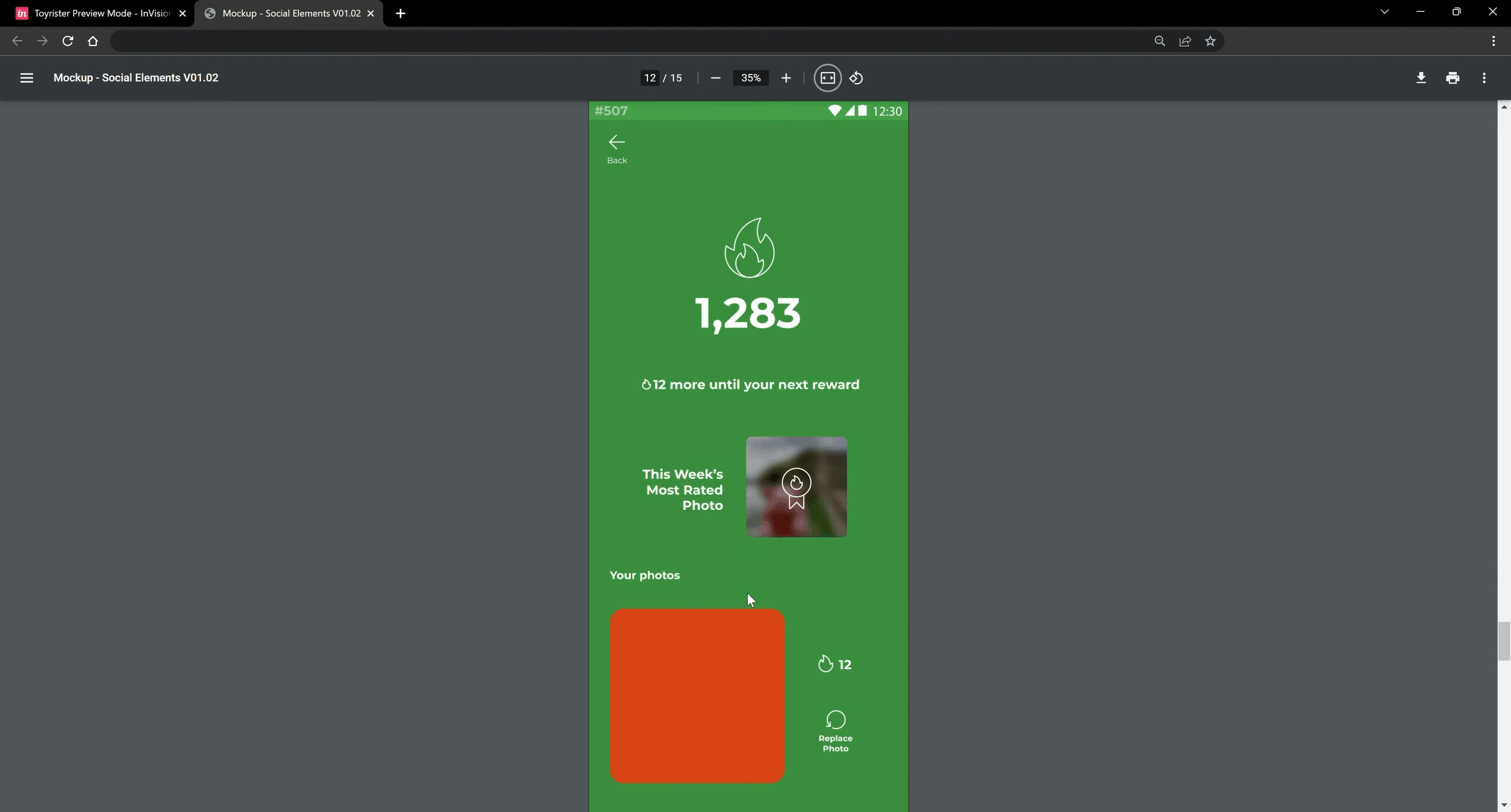
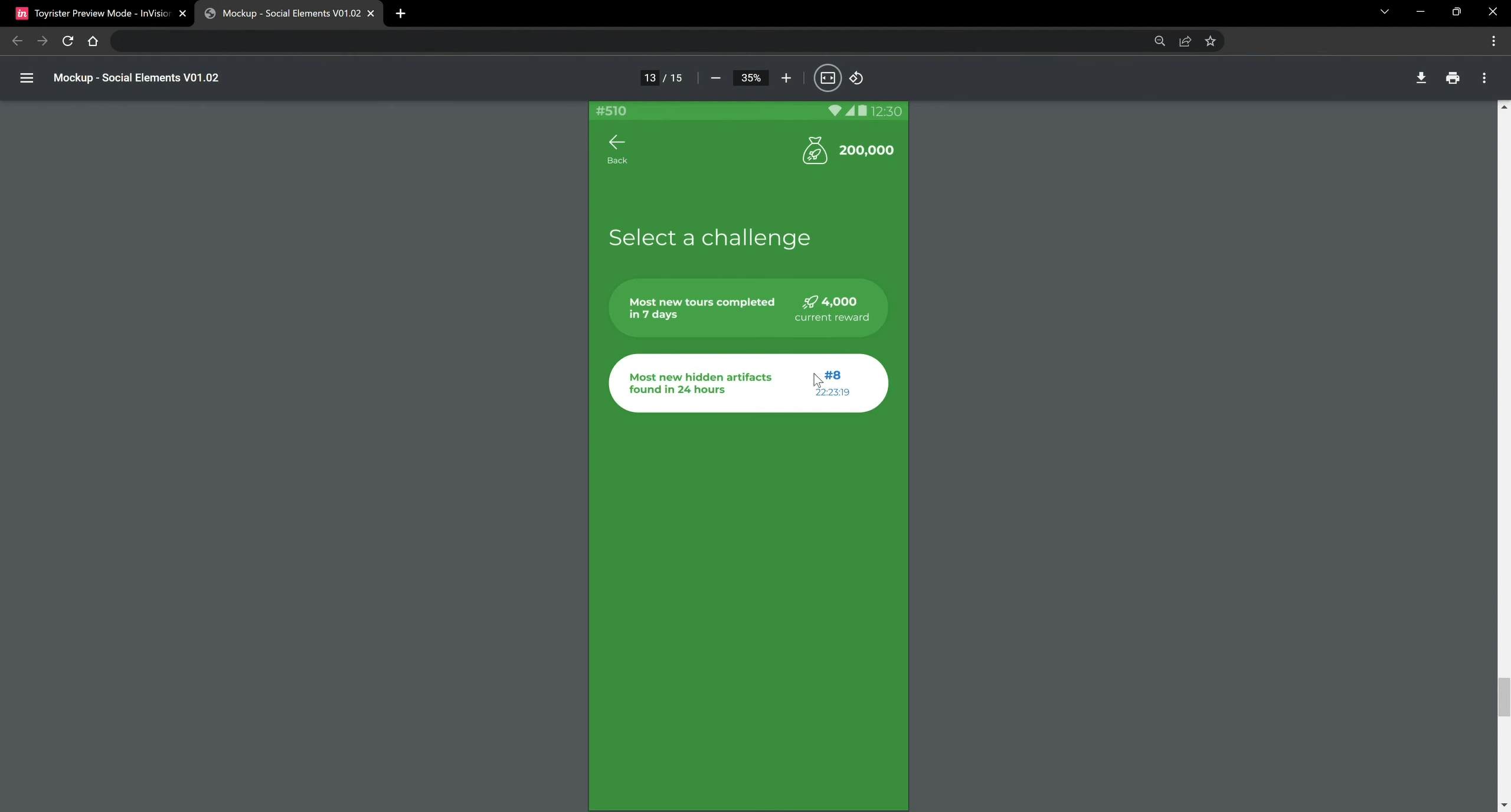
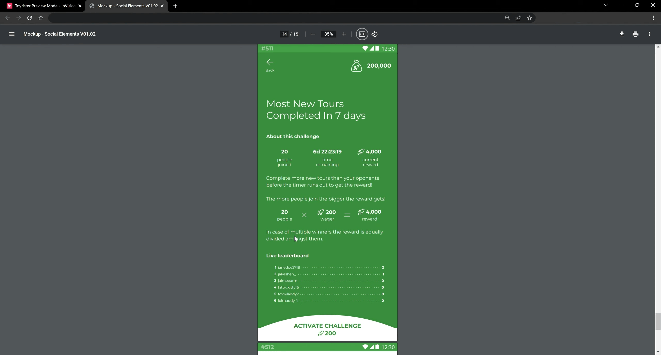
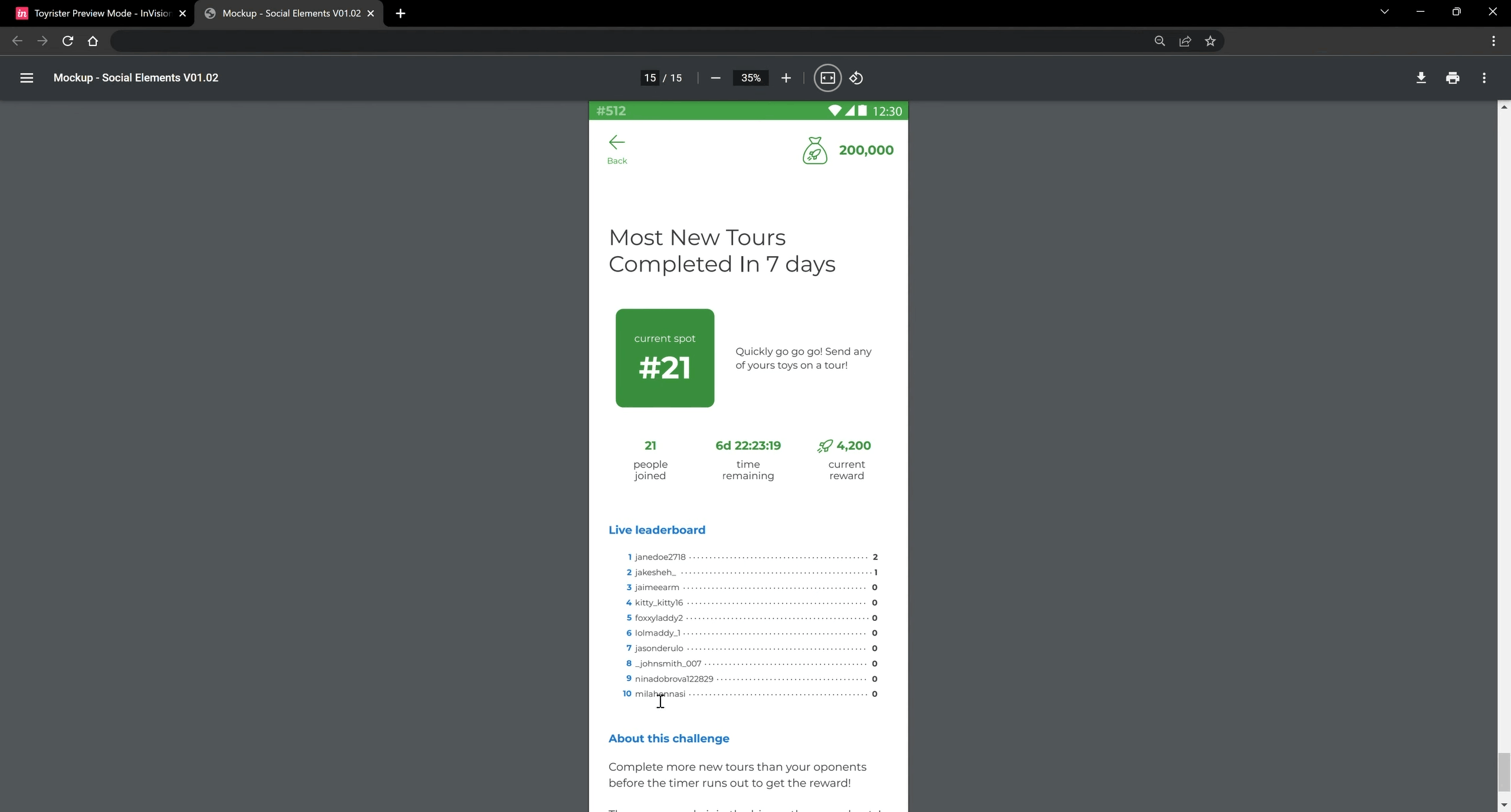
  • The Architectural Solution: Stepping into a proactive product strategy role, I identified retention blind spots and architected net-new gamification workflows that the founders hadn't initially considered. By mapping out secondary navigation states, challenge progression loops, edge-case recovery flows, and rewarding visual feedback, I transformed the app from a one-off utility into a sticky, multi-hour daily travel companion.

Pillar 3: End-to-End Interactive Flow & State Prototyping

  • The Diagnosis Addressed: Static, disconnected mockups failed to demonstrate how users would actually progress through multi-step challenges, branches, and screen transitions.
  • The Architectural Solution: I built a comprehensive, high-fidelity interactive prototype linking the entire application lifecycle—demonstrating seamless transition states, interactive tap targets, and core feature flows. This living blueprint served as the single source of truth for both internal engineering alignment and external stakeholder/investor validation prior to backend code commitment.

Pillar 4: Modular React Native & SASS Component Architecture

  • The Diagnosis Addressed: Traditional design handoffs risk UI drift and slow down mobile engineering sprints.
  • The Architectural Solution: Partnering directly with the development team during implementation, I translated the finalized mobile UI into clean, production-ready React Native layout structures and modular CSS/SASS styling. I engineered a reusable front-end styling system—standardizing spacing scales, color variables, button hierarchies, and custom form inputs—and audited front-end code to guarantee pixel-perfect deployment across mobile devices.

4. The Impact: Measured Against the Diagnosis

By combining 0-to-1 product discovery with hands-on React Native UI execution, I accelerated Toyrister from a raw founder vision into a tangible, scalable mobile platform:

Root Problem #1:

Abstract, fragmented founder concepts stalling MVP.
Architectural Intervention:

Led collaborative ideation critiques and structured a visual-first mobile IA.

Measurable Impact:

Translated raw startup concepts into a unified, market-ready mobile architecture.

Root Problem #2:

Linear user flows lacking daily stickiness.

Architectural Intervention:

Proactively conceptualized and mapped net-new gamified challenge and retention loops.

Measurable Impact:

Expanded product utility and user stickiness, maturing the app's product-market readiness.

Root Problem #3:

Stakeholders unable to evaluate flows from static screens.

Architectural Intervention:

Built an end-to-end, state-driven high-fidelity interactive prototype.

Measurable Impact:

De-risked backend engineering and provided founders with a tangible product asset for stakeholder pitches.

Root Problem #4:

Design-to-dev translation gaps in mobile UI

Architectural Intervention:

Coded and audited reusable React Native & SASS layout structures and style variables.

Measurable Impact:

Eliminated front-end handoff friction, drastically reducing engineering build time while ensuring pixel-perfect fidelity.

Table of Contents

Screenshot Screenshot

Featured Case Study

Stuck In Legacy World?

See how I brought a complex B2B legacy desktop software into the modern web age

View Wex Case Study